@36daysoftype - project round up and evaluation
@solchadwick
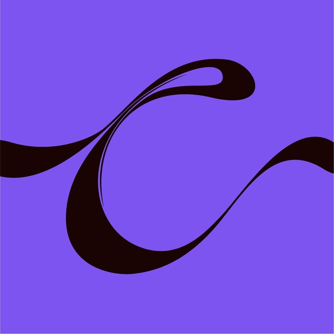
By today we had to submit a summary of our 36 characters from start to finish. My set was eclectic and colourful as I had set out for with an interesting set of visual trends that picked up intermittently throughout either through unconscious design or coincidence. I displayed the full 36 on one tile, then a spelt out message 'THANK YOU 36 D.O.T" and then my top 3 most liked posts. Coincidentally 2 of the 3 top liked came from the set of number, maybe a reflection of my growing confidence, experimentation and time committed as the project progressed. I think my response did certainly increase in complexity as the days passed and there were certainly some lulls in the middle as it became tricky to maintain a certain standard. I also found that attaching the letterforms to certain artists or movement and then tagging said artist/movement helped to generate likes from non-followers. I certainly found myself becoming increasingly immersed in the production of each character as the project progressed, moving from 30 minute - 1 hour or so on the first few submissions to some near full-day projects on certain letterforms as I put in 5 hours or so on refining the form. I was disappointed to not get featured for some of my stronger letters but with the hundreds of thousands of submissions generated via the 350k+ strong social media account @36daysoftype I am really not surprised and should just try again next year for a better chance. In terms of following 36 days of type was very helpful as I gained probably 50 followers over the month or so that I completed the project. I also gained some new contacts within typography who complimented my work, taking this brief beyond a research project/competition brief and into a PPP related project as well.
I have created 36 potential starters for new typefaces and picked up a lot of very transferable skills such as 3D rendering techniques in photoshop, an increased understanding of true 3D software such as blender and increased dexterity with a pen as well as a plethora of new typographic styles that will all impact my lateral references when creating type. I have already had a few people contact me asking if they can have some custom lettering written out in one of the styles below so there are a lot of future potential clients from this as well and its bolstered my Instagram feed, giving prospective followers a wide selection of styles to enjoy. I think going forward maybe I should redefine my style a focus on a slightly more focused overall aesthetic but this project has been so valuable for me artistically, theoretically and productivity-wise.
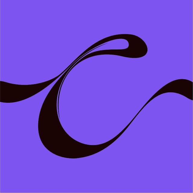


Comments
Post a Comment