Posts

Showing posts from April, 2020

Fashioning the industry - Rob Boyd

Image
A couple of weeks ago I emailed a portfolio to Rob Boyd as a reply to an open call for type orientated graphic designers. It was a nice affirmation for him to ask for one based on my Instagram profile but I haven't heard back from him so I'm assuming he wasn't interested as he knows were to find me. Rob is a fashion designer with a passion for technical wear, I have been following him for a while and free like I could provide some interesting designs for his specific industry. He was asking for logotype work for 'soar' a running brand for whom he is the chief designer. With this in mind, I compiled a custom portfolio to send to him with a rethink of a tiny personal brief that I did over summer for my dads running club. This practice in tailoring a portfolio for a very specific industry is a useful development for me and hopefully, I will be in his mind a tiny bit even if my work wasn't right for the call in question. Here are some Instagram screenshots and t...
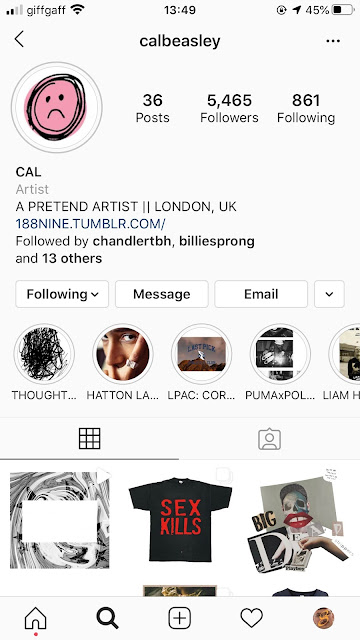
Fashioning the industry - Prospective work with Cal Beasley

Image
For a while, I have been exchanging pleasantries with SE London artist and videographer Cal Beasley. Cal has worked with a host of streetwear industry names from Nike to Samuele Ross to Liam Hodges. I understand he works as an assistant to Will Reid on shoots. Will does photography for one of my collaborators/clients from this year DENIAL so I presume this is where the connection started. I am a fan of Cals work and recently was invited to participate in a publication he is compiling featuring images of creative in quarantine, so I obliged a somewhat cringe image of myself for the publication and asked if he'd be down for some collaborative work in summer. I think the fact that Cal is linked to Liam Hodges whose name keeps coming up through different projects is a good omen and I'd love to work for Liam one day, perhaps with Lou Alsop if that comes up. Anyway, any project with Cal is as yet unconfirmed and I need to set the ball rolling with ideas as I was the one who suggested...

36 days of type bonus - &

Image
As a quarantine bonus the organisers have added an extra character to symbolise togetherness. With lots of stuff on I didn't have much time to produce this surprise edition so I just did some quick research confirming the etymology the ampersand before getting sketching with a 6mm pen. "& is for ampersand - a quick entry for the bonus round. Originally the 27th letter of the Latin alphabet, derived from the ‘et’ ligature used in cursive writing"

@36daysoftype - project round up and evaluation

Image
@solchadwick By today we had to submit a summary of our 36 characters from start to finish. My set was eclectic and colourful as I had set out for with an interesting set of visual trends that picked up intermittently throughout either through unconscious design or coincidence. I displayed the full 36 on one tile, then a spelt out message 'THANK YOU 36 D.O.T" and then my top 3 most liked posts. Coincidentally 2 of the 3 top liked came from the set of number, maybe a reflection of my growing confidence, experimentation and time committed as the project progressed.  I think my response did certainly increase in complexity as the days passed and there were certainly some lulls in the middle as it became tricky to maintain a certain standard. I also found that attaching the letterforms to certain artists or movement and then tagging said artist/movement helped to generate likes from non-followers. I certainly found myself becoming increasingly immersed in the production of each ...

36 days of type - 9 FIN

Image
This is now the 36th day that I've woken up and been filled with dread and excitement as I scrambled around for research and prepared a response for 36 days of type. Today was the turn of the number 9 which I would ordinarily form by flipping a 6 and performing some minor adjustments but today, of course, I had to go out on a solid level and make sure the quality (which I think has been exceptional throughout the numbers) doesn't drop. This thought, however, can put a lot of pressure on and today, like any other, I felt at times that the number was largely shit. I was a little worried about my choice of number as it dates back to a similar era as most of the letters but I think the style itself has such strong connotations of an era Scifi era that its pretty transient across time. Time, however, was the reason that linked Futurism to the number 9 as I found out the movement was conceived in 1909. Credited to an Italian poet called Filippo Tommaso Marinetti who released his Ma...

36 days - 8

Image
Another day another tribute to modernism. I have found that the modernist era displays a plethora of numerically represented art and design due to the fundamentalism of the time. Russian constructivist Wassily Kandinsky displayed a utopian perspective as part of the Russain Avant-garde of the 1920s. As a defining characteristic of constructivism, he used rigidly geometric forms that overlapped constantly on a two-dimensional plane but his flagrant expressionism was against much of his typically constructivist peers and gave him particular poignance during the Bauhaus epoch.  "Composition 8   (  Komposition 8  ) In 1922 Kandinsky joined the faculty of the Weimar  Bauhaus , where he discovered a more sympathetic environment in which to pursue his art. Originally premised on a Germanic, expressionistic approach to artmaking, the Bauhaus aesthetic came to reflect Constructivist concerns and styles, which by the mid-1920s had become international in scope. Wh...

How to sell your typeface - Creative Bloq article. Brief 8 cancelled

An interesting article I found on Creative Bloq has made me realise that producing a type foundry right now wouldn't be the best use of my time and therefore I'm going to scrap brief 8. The original timetabled proposal was to use some of my final month to get a physical specimen out in collaboration with a craftsman, however, with covid-19 it doesn't look like that's going to be possible and I have taken advice that there could be a few headaches with setting up my own digital foundry, namely around licencing and without interaction with the buyer there could be some issues around licensing that I don't have the financial means to enforce. It's probably better to sit on the idea for now and look into selling fonts through a mediating third party.      "You've created your own typeface. Now what? Whether you harbor a secret desire to see designers and  creative directors  around the world using your fonts, or simply put some recent downtime to go...

36 days - 7

Image
Todays 7 was inspired by yet another modernist artwork from my favourite genre of modernist sculpture 'mobiles'. Alexander Calder is widely credited as being the inventor of the medium but I first became interested in them through Bruno Munari who featured earlier in my series. Today I delved a bit deeper into the history of mobiles to help educate my response. The sculpture is named in classical modernist, descriptive, fashion as it features 7 horizontal disks as a variety of more abstract shapes that hang purposefully and revolve around each other in perfect equilibrium and poise. This sense of reliance of forms and balance was essential within my 7. One of the main reasons I chose this sculpture was its immediate resemblance to the number in question. I wanted to mimic some of the joins and reliant angles in a way without overly ripping off the exact configurations of Calder discs. "Who made the first mobile? Or, who invented mobiles?  The short answer is that ...