36 days - Z
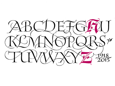
The end of the alphabet is finally here today before we progress onto the numbers tomorrow. Z was as expect a tricky number to select and having previously thought I'd go for something Aztec themed by focusing on the art of the Zapotec people I instead last-minute switched onto the influential typographer and masterful calligrapher Hermann Zapf. Zapf is famous for the likes of Palatino, Optima and Zapfino. He was a wonderfully versatile typographer as someone of his generation would have to be to continue working into their 70s, he designed originally for hot metal type, then photosetting and finally taught and produced digital type from the late 70s onwards. Having an excellent eye for hand-drawn type its no surprise that when Zapf wasn't doing calligraphy he opted for humanist, Roman or Roman Renaissance-inspired forms that featured strokes curving out towards serifs and wonderful fluidity and formality.


The idea of intertwining the two letterforms gives some sense of depth and allows the composition to appear holistically stronger than either of the characters in isolation. Blue is used as the accent colour as colour picked from some of his designs found in research, applied to a paper effect background again furthering the sense of depth and also giving a mid-century feel when Zapf was debatable in his prime.

As a tribute to the versatile typographer, it would have been a shame to create only one Z and would have been tricky to choose between each of his distinctive styles, for this reason, a mixture of forms was favoured quite early on. I also wanted to finish the alphabet with some calligraphy before the numbers, not many of which I could envisage being calligraphic.


"Z is for Zapf - a tribute to Hermann Zapf, the versatile German typographer drew inspiration from renaissance forms and created some of the best-known serifs of the modernist era, later adopting digital typesetting. He was also a masterful calligrapher."


Comments
Post a Comment