36 days - Y
Today was always only going to be one thing an that is y2k, without a multitude of design crazes beginning with the letter Y and already some experience within the field of research owing to my jewellery branding project, it was a natural choice. Of course, logotype and distinctly techi type of the time was the first port of call as I began to experiment with a wide variety of techniques from the short-lived utopian future crazy that emanated from the early naughties. In a world that had just survived the biggest computer bug in the digital age, digital optimism and faith in technology seemed through to logotype design across a surprising range of industries, not exclusively those that deal with digital means as a core value. Dynamic type, inspired by everything from robotics to electronic clothes tags became the fetishised aesthetic and has continued to be viewed as such in certain industries and by Tumblr teens every since. Below is a range of research form previous sketches by me (orange) and typography of the time.


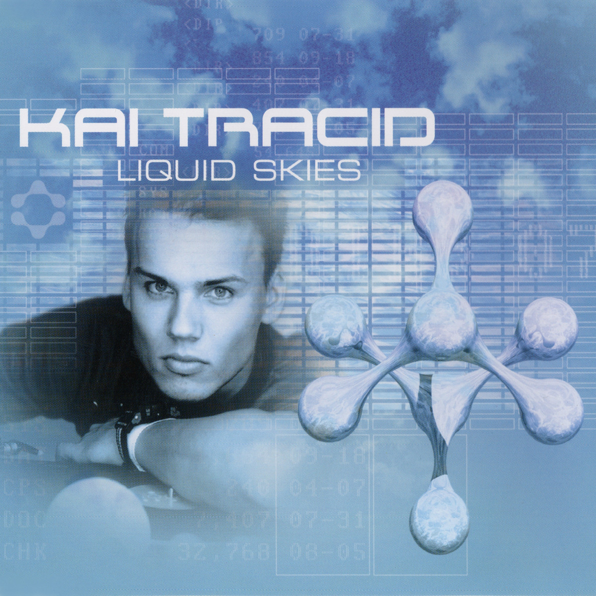
There was also some research into modern interpretations of y2k typography by the French typographer Charles Quirouard, who creates incredibly detailed sometimes moving globular structures that resemble robotics and computer type.


With this in mind, I got sketching for what felt like forever, there are so many different and incredibly fun to draw approaches to a y2k aesthetic that it's hard to work out exactly what you want to with it before exploring a range of avenues. I wanted to explore the contrast of a globular form against a rigid structure that conformed in some way to a grid like system as I have also been looking at circuitry as a costituent of non typographic research. For this reason a lot of my sketches featured elongated circular forms.


Using the burn tool to create shadow and the dodge tool to highlight certain areas fo the globular form I created a 3D illusion to give some depth when combined with the brushed steel of the body material. Metal and computer rendered graphics are two hallmarks of y2k design. I feel the globular shape appeared fairly realistic for a first effort with the tools and after a few adjustments taking into consideration the angle the light would be reflecting at the final piece was finished. I would love to use the tool again it was very satisfying and an expansion of my skillset. I also added a secondary tile that highlighted the influence of circuit boards on the composition.


There was also some research into modern interpretations of y2k typography by the French typographer Charles Quirouard, who creates incredibly detailed sometimes moving globular structures that resemble robotics and computer type.


With this in mind, I got sketching for what felt like forever, there are so many different and incredibly fun to draw approaches to a y2k aesthetic that it's hard to work out exactly what you want to with it before exploring a range of avenues. I wanted to explore the contrast of a globular form against a rigid structure that conformed in some way to a grid like system as I have also been looking at circuitry as a costituent of non typographic research. For this reason a lot of my sketches featured elongated circular forms.


After using a considerable amount of paper on searching for a solution I decided to digitalise a few to get a better idea of what would look best on-screen, an essential for y2k typography and of course for the Instagram based competition.

The balance between circular and straight-line qualities was very visually interesting but as simple flat objects did look a little boring. For this reason, I started to apply gradients in a low-fi bid to gain some depth but after picking the below Y decided that I would need to leave my comfort zone any attempt some shading on photoshop.


"Y is for Y2K - the short-lived early naughties movement of utopian futurism that imagined typography in a new digital age."


Comments
Post a Comment