36 days - S
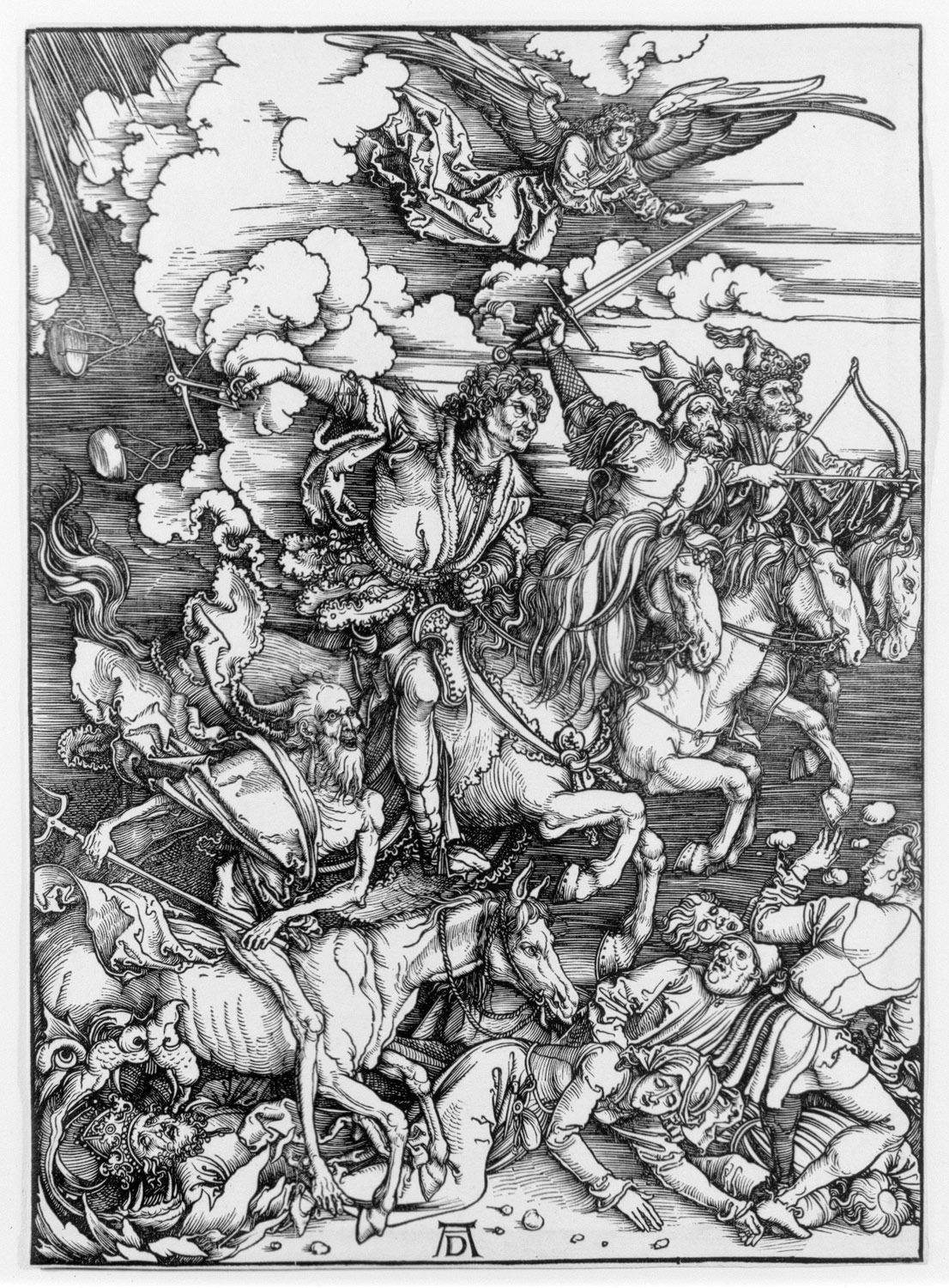
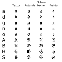
S is for Schwabacher the Germanic genre of Blackletter that preceded the previously referenced Fraktur. It wasn't easy to pick out Schwabacher over the other S options including structure, serif and slab but Schwabacher was always going to be way more enjoyable to do. It was popular during the 15th century as the renaissance era brought back a sense of humanist touch into type design after the rigid vertical lines of texuralis. Its vibrance and contrast between curved forms and sharp barbed edges summarised the era perfectly. The S for itself almost forms a full circle as the tail is often seen interacting with the top bend, creating an incredibly satisfying form. There were also a number of notable historic texts from the era written in Schwabacher to aid my visual research including the Nurumberg Chronicle, Albrecht Dürer's Apocalypse series and the Luther Bibles of the era.


To make the most of the gradient effect caused by changing the ink cartridges I decided to scan the sketchbook page and use as near to authentic ink colour as possible on the final piece, this also linked into the movement to humanist type as there's a clear analogue influence of the hand. Also, I used the cross appropriated from Lutheran bibles of the time found in research as a subtle border. Looking at it in hindsight, I should have done the final sketch on clear paper as the grid shows through but I wanted to process to be as lateral as possible so they're all a humanist part of the final composition. Here were my final two tiles, in two colourways:


I began to sketch the S and changed by ink cartridge as I was doing so, so that that there would be a subtle gradient achieved as the clue and pink ink mixed. This was an attempt to reflect the newfound exuberance of the renaissance era in an innovative way. As blackletter progressed away from the hard lines of textualis and into back into the blatant influence of the hand. I also experimented with some multiple line embellishments but this didn't feel true to the genre. Ways of integrating the closely linked top flick and below curve so as to reflect the link of on the corresponding side were also attempted but this reduced legibility roo much an made the S too symmetrical.


To make the most of the gradient effect caused by changing the ink cartridges I decided to scan the sketchbook page and use as near to authentic ink colour as possible on the final piece, this also linked into the movement to humanist type as there's a clear analogue influence of the hand. Also, I used the cross appropriated from Lutheran bibles of the time found in research as a subtle border. Looking at it in hindsight, I should have done the final sketch on clear paper as the grid shows through but I wanted to process to be as lateral as possible so they're all a humanist part of the final composition. Here were my final two tiles, in two colourways:


Comments
Post a Comment