36 days of type - U
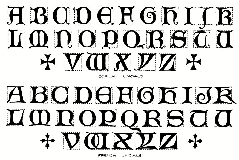
There aren't too many typographic terms beginning with U and I suspect there won't be from here to Z. The main one I could think of was Uncial, the all capital script used from the 4th to 8th century AD by Latin and Greek scribes in the middle ages. Uncials has a simplicity of form that you don't see in later, more decorative blackletter but it can also be described as a Gothic text. These days more commonly associated with Irish bars the style has been forgotten a little but I think its quirks and at times elegant transitional strokes can be translated into modern aesthetic quite easily. With this in mind, I decided to stray a little away from the calligraphic weightings of the original typeface and go for a way more chunky form as that displayed tasteful contrast. There's a beautiful uniformity to uncials that makes the type almost modular at times as most letter conform to the same rounded module. This makes me perceive it as a form of writing somewhat before its time in terms of modernity, hence the decision to go a little off-piste and create a slightly further untraditional rendition. Uncials were the universal (swiss) style of its time.
There was also, of course, some variation in the 4 decades of uncial usage, the most common was half uncials which featured much straighter vertical lines instead of the trademark circular silhouettes. There were also regional variants across all of Europe.
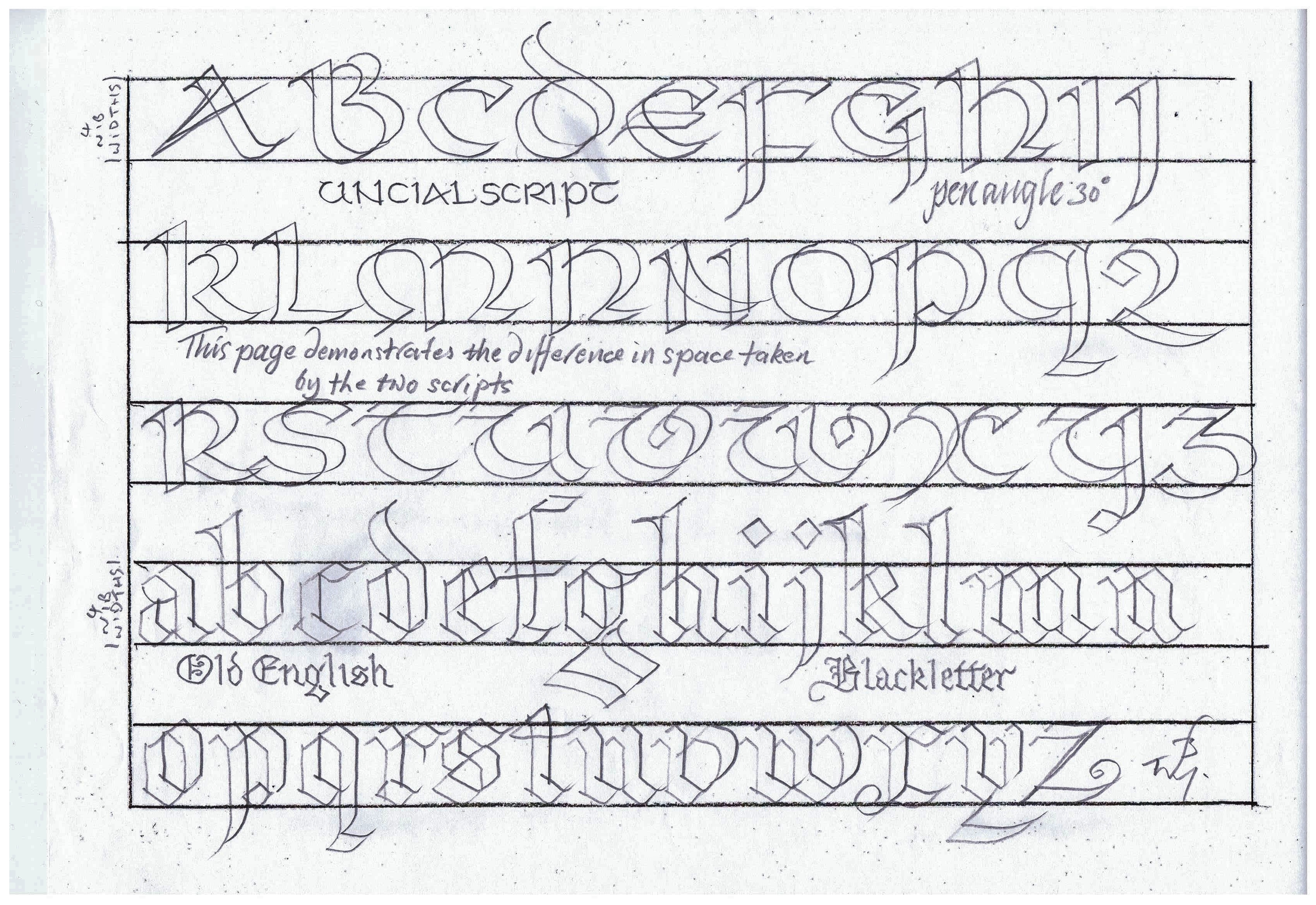


Sketching began with forms that displayed some unusual notches and kinks in the serifs atop each side of the U. This was an attempt to represent the somewhat gaudy antiquity of the typeface and the scope within its modular forms to add decorative flair as a means of legibility and individuality. This often happens with purposely simplistic type for universal use, the guidelines will be set out but the scribe will still search for some individuality within them. In an attempt to reflect the often modular appearance of uncial forms I eventually found a method of sketching using the grids on the paper to create characters that conformed to a perfect 8x8 square box. Then it was just a question of finding a balance between the chunky block serifs and the potentially bulbous rounded stroke. I didn't want uniformity but at the same time it was important to not push the nonuniformity too far to the point of the uncial starting point being unrecognisable and a more psychedelic or art nouveau form emerging.. entirely different approaches to type.


There was also, of course, some variation in the 4 decades of uncial usage, the most common was half uncials which featured much straighter vertical lines instead of the trademark circular silhouettes. There were also regional variants across all of Europe.


I decided to finish the pieces in a sort of bluish-green mix that was a reflection of some of the teal decorative paint found in certain pages from research. The negative U would then have a slightly worn texture as if left as a window through to some old paper.
Post:
"U is for Uncial - I think the calligraphy was getting a bit tired so here’s a non traditional interpretation of the all uppercase script employed for both Greek and Latin manuscripts from 4th to 8th century AD. Employing the rules and structure of Uncial whilst focusing on weight and negative space."
Comments
Post a Comment