36 days of type - T
T is for the style of blackletter that actually proceeds yesterdays Schwabacher. Textualis or textura blackletter and is also linked to my J as the style Johanes Guttenberg used for his Guttenberg bible can be classified as a form of textualis so I've got a lot of experience in this particular style by now, therefore, today's presentation was important to make the form interesting and not get too bogged down in uniformity of my alphabet. It's unfortunate that these three forms of blackletter writing including tomorrow Uncials come together in order and I couldn't think of any other writing styles or features beginning with T. Turning this into a positive though its an opportunity to innovate and demonstrate I am versatile within the genre.
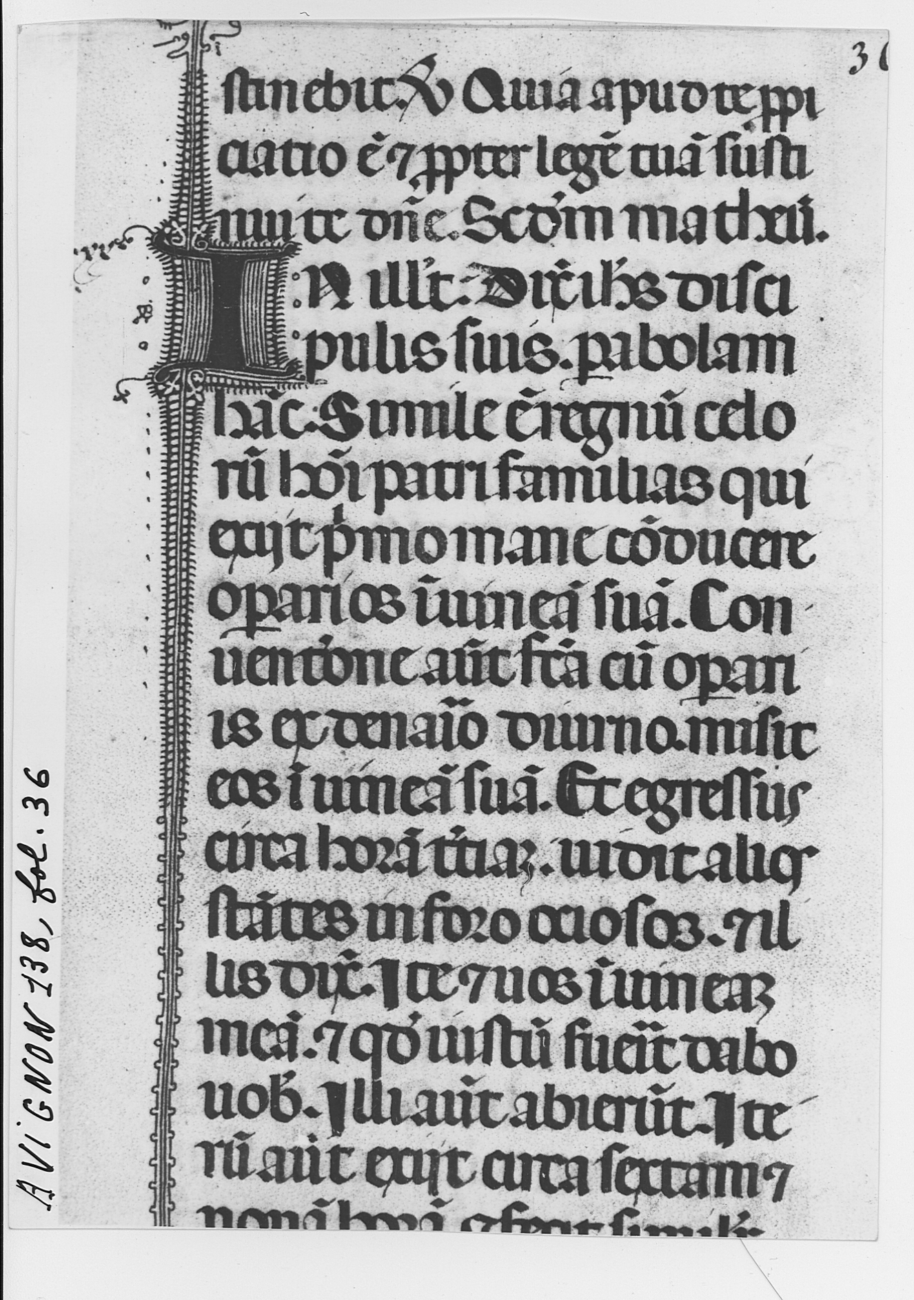
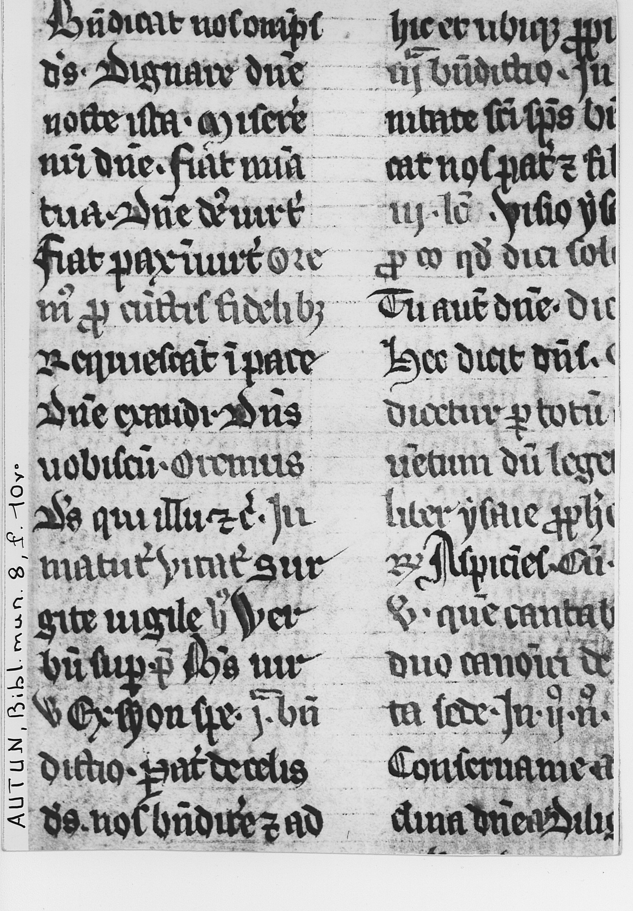
I did learn however that there are many different forms of textualis that fit under the blanket term, this is not surprising considering the style was popular for hundreds of years between the late 1200s and early 1500s. Also, the term applies to many regions of type across Europe so the first thing to consider was the exact genre of textualis I wanted to employ.
Littera textualis (popular in hand written and early printed publications of the time):

This form is called Textualis Meridionalis:
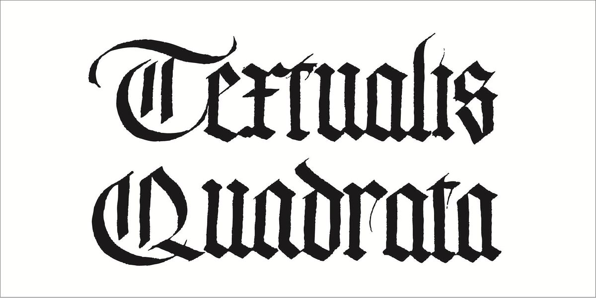
Textualis Quadrata (as used in its most linear form by Johanes Guttenberg)
Textualis Rotunda:

With this in mind, it was time to get sketching some letterforms. The textualis and blackletter in general T has long been stylistically abandoned in favour of the linear upright form we see today, the first signs of which can be seen in textualis quadrata and other very ridged forms of blackletter. I wanted to juxtapose this upright lineage of the T with some curvature but was also mindful of not creating a too fluid form that could come across as rotunda or another later form of the genre. Embellishments in the form of rhombuses and double lining were also trialled in a variety of weights.


I did learn however that there are many different forms of textualis that fit under the blanket term, this is not surprising considering the style was popular for hundreds of years between the late 1200s and early 1500s. Also, the term applies to many regions of type across Europe so the first thing to consider was the exact genre of textualis I wanted to employ.
Littera textualis (popular in hand written and early printed publications of the time):
This form is called Textualis Meridionalis:
Textualis Quadrata (as used in its most linear form by Johanes Guttenberg)
Textualis Rotunda:
With this in mind, it was time to get sketching some letterforms. The textualis and blackletter in general T has long been stylistically abandoned in favour of the linear upright form we see today, the first signs of which can be seen in textualis quadrata and other very ridged forms of blackletter. I wanted to juxtapose this upright lineage of the T with some curvature but was also mindful of not creating a too fluid form that could come across as rotunda or another later form of the genre. Embellishments in the form of rhombuses and double lining were also trialled in a variety of weights.


In the end, a semi-cursive format was favoured due to its satisfaction as a wholistic form. The almost figure of eight shaped upper and tail-flick that came back in towards the backbone are based on a mixture of textualis styles that both clash and sympathise.
Finished with stroke notations as though the form is set out in a calligraphy textbook to give a little more decoration and allow the viewer to appreciate the craft of the complex form. The dark green colour was based on the ageing of certain black inks that can cause them to fade into a slightly green or blue hue.
Post:
"T is for Texualis - a blanket term for early forms of handwritten blackletter used throughout the mediaeval period. This form encompasses a contrast of the angular central lines, a characteristic of Textualis Quadrata and curvature typical of Textualis Cursiva or Rotunda. Stroke guides included to show the movement of the pen and give a lil extra sauce."


Comments
Post a Comment