36 days of type introduction to numbers and 0
Today marked the transition onto my final 9 days of the competition with the number 0. Yesterday after I finished my letters I was faced with a mild panic as I have to now create 9 numbers but hadn't yet mapped out the strategies for this. I had only made a list of potential topics up to Z so quickly compiled some research into areas of the art and design world that I could play on beginning with or in reference to the given number. 1000 google and lots of key number searches later I arrived at a WIP list of potential topics:


Starting with the shape in grey I used the burn and dodge tools to shade the form and the frosted glass effect coupled with a cloud overlay to create some random dimbles and uneven texture. The backgrounds were, of course, kept monochromatic so link in with the aesthetic of the movement and the oulines left quite raw and pixelated to further mimic a texture. I was really happy with the outcomes and they were well received, it was a good opportunity to shed some light on a movement that is new to me and brush up a little on my origami skills (or not) and my photoshop illustration and shading. The light source I imaged to be coming from the top right and bounding off the raised faces of the sculptural form. The product goes beyond type a little and is more of an artistic composition.


0 - ZERO
1 - minimalism
2 - dualism or phonecian alphabet? (22 characters)
3 - 3D
4 - cubism
5 - les cinq? Or fab 5 Freddy
6 - 6 principles of gestalt or Paul Klee
7 - seven deadly sins? The seven arts? Seven horizontal discs by Alexander Calder
8 - composition 8 by Kandinsky or the eight
9 - futurism 1909
With this out the way, I got onto my 0 which was inspired by a movement I hadn't fully recognised until this morning.
"The Zero Group was a loosely knit group of artists that emerged in Germany and spread to other European countries in the 1950s, led by Heinz Mack, Otto Piene, and Günther Uecker. The artists came together with the collective desire to move away from subjective postwar movements like the French Art Informel and Tachisme. The main idea was to create art that was purely about the work’s materials and the world in which those materials exist, de-emphasising the role of the artist’s hand. The focus was on light and space."
"The name refers to the countdown for a rocket launch and according to the group is meant to evoke ‘a zone of silence [out of which develops] a new beginning’.Three issues of a journal, Zero, were published, in April and October 1958 and July 1961. The group dissolved in 1966."
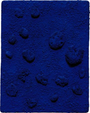
I looked into art produced by the group as well as some of the inspirations behind their work. The main spark behind the approach of the group is, of course, the space race of the 50s which was eventually realised with the moon landing in 1959, a year after the first Zero journal was produced and at a time when the group was consistently exhibiting. The group produced a lot of physical works using 'space-age' materials such as aluminium foil and reflective pieces of mirror. The monochromatic aesthetic helps to accentuate the theme of playing with light and devoids distraction from external colours. One of the few colour pieces I found by the group, featured below in blue provided much of the primary research for my second attempt at making the zero, once I moved to a digital approach. Images from the moon landing were the other main contributor to this end aesthetic as I wanted to create a form that reflected an alien material in the moon, whilst also in part appearing metallic. The first, discarded idea was based more on the reflection of light caused by the (at the time) space-age material aluminium foil.
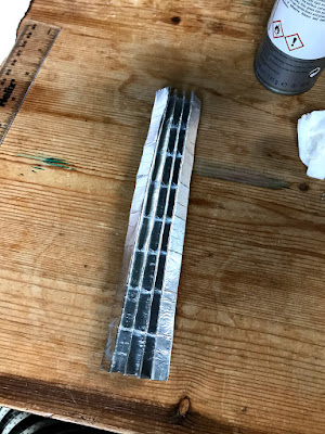
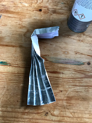
I started with a physical approach in an attempt to create a 3D 0 out of tin foil but fairly early on it became apparent that the medium was with too think to fold when on its own and to award and unforgiving when stuck to paper. I was following this tutorial on how to make an origami 0 https://www.youtube.com/watch?v=5-_9p_XvatI. Which should have looked something like the one below but after a few attempts I decided there were better way to spend my time. The plan would have been to photograph my 3D zero from multiple angles and montage them together inro one abstract and wholly artificial-looking form.


The initial sketches looked somewhat like a sanitary towel but I knew what I was getting at with two globular spheres flanking an abstract negative space and some indents on the top and bottom designed to look like the creases in tin foil. Initially, this had been the aim of this second idea, to try and digitally recreate foil but that was actually harder than in sounds. I did also think about making a sculpture out od scrunched tin foil but the material loses much of its reflective properties when it become too crumpled so I decided it was one best left as a concept. The clipping masked tin foil effort below was neatly there but I was finding it tricky to map the contors of the foil to the globular shape so decided to take my production entirely digital.


Starting with the shape in grey I used the burn and dodge tools to shade the form and the frosted glass effect coupled with a cloud overlay to create some random dimbles and uneven texture. The backgrounds were, of course, kept monochromatic so link in with the aesthetic of the movement and the oulines left quite raw and pixelated to further mimic a texture. I was really happy with the outcomes and they were well received, it was a good opportunity to shed some light on a movement that is new to me and brush up a little on my origami skills (or not) and my photoshop illustration and shading. The light source I imaged to be coming from the top right and bounding off the raised faces of the sculptural form. The product goes beyond type a little and is more of an artistic composition.


Post:
"0 is for ZERO - a tribute to the 1957-66 Avant-Garde art movement that claims its name from the countdown before a rocket is launched ‘the momentary zone of silence, out of which develops a new beginning’. Characterised by monochromatic sculptural forms that utilise light and space to open up new forms of perception."


Comments
Post a Comment