S.O.D developments crit
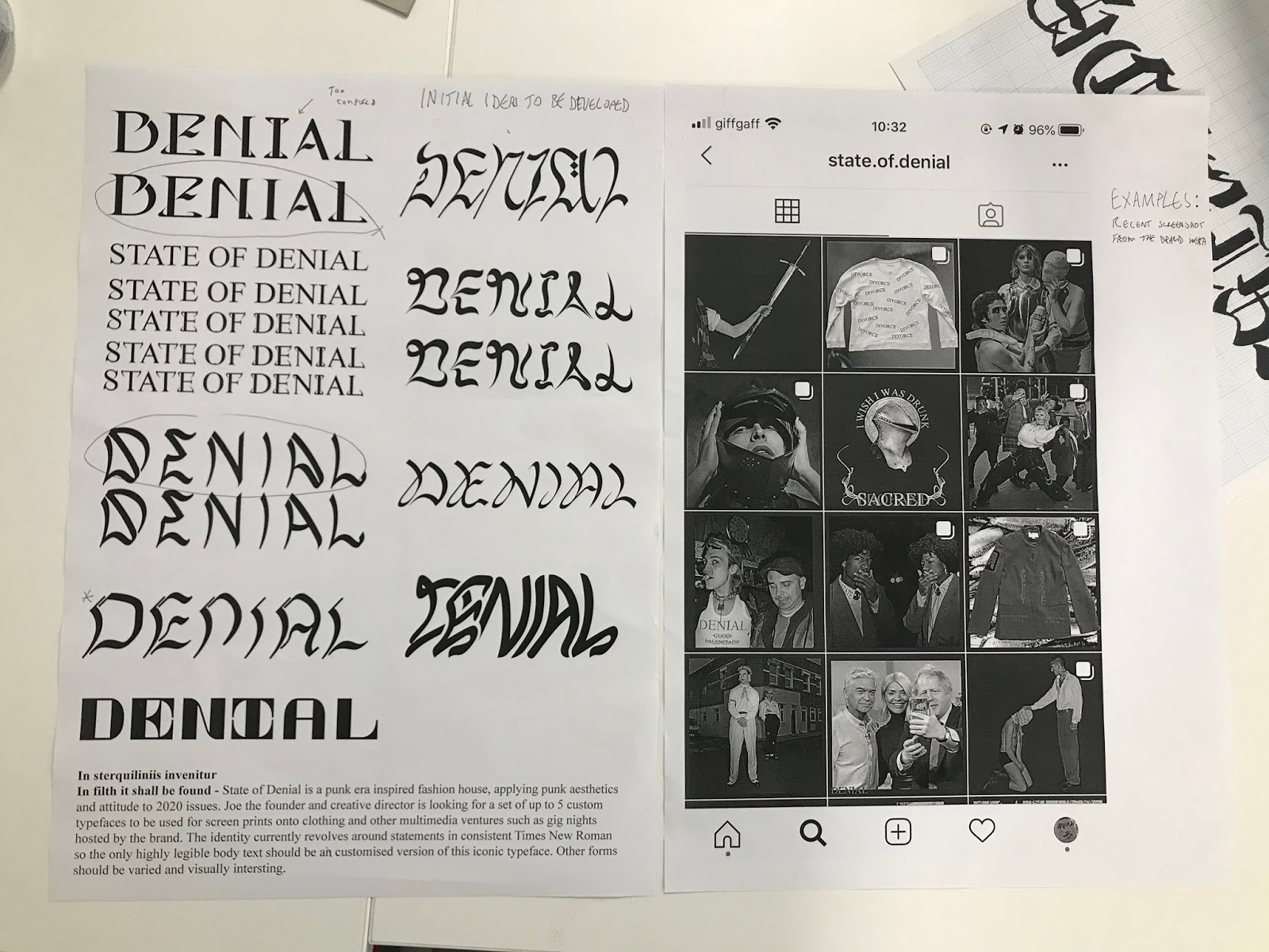
Today we had a silent crit so I decided to show my most complete current work in progress. I think I put too much emphasis on the punk style of the brand in the short description at the bottom of the page as a lot of the comments were fairly centred around experimenting with typically punk tropes such as DIY style manipulation and deconstructed or mixed letterforms. As these are not what has been requested by Joe I won't be indulging in these aesthetics too much but also I must ensure I maintain the punk spirit throughout development. There was some preference for the more cursive face ideas such as the second down on the right and the bottom right as these felt more human or DIY. I think the second down on the right should be developed even if not for this project as it contains some beautiful forms. There was also some pointers as to which example of two of the lefthand typefaces should be used with the upper of the two being deemed too confused, a factor I had myself though as the I and N are a little off balance. There were also very valid comments about seeing some of the type in context, whether that be in the brand colours or printed or stitched into clothing. These are developments that I would really like to make later along the line and look forward to making as and when.
When I asked Joe he seemed to have a preference for the top and bottom left designs for this specific poster but also enjoyed the fluid cursive number on the second downright so I think these should be the priorities for further development right now.


When I asked Joe he seemed to have a preference for the top and bottom left designs for this specific poster but also enjoyed the fluid cursive number on the second downright so I think these should be the priorities for further development right now.


Comments
Post a Comment