Brief 11? - STATE OF DENIAL brief brief pitch and some initial research
Last month a guy called Joe contacted me via Instagram to request some custom typefaces or the use of existing stuff as promotion for 'State of Denial'. Described as “a sustainable fashion and fine art collective, focussing on inward frustrations with mental health and sexuality to a more outward frustration with the British government and environmental destruction." To me, the collective has a definite punk ethic and aesthetic which has received plaudits and publicity from some pretty big UK musical artists and is set to feature in an upcoming Coeval magazine article which will hopefully give it some of more of the attention it deserves. After dabbling in typographic sketches for them over the last month I've decided to refine the work into brief 11 and will potentially use it to replace another brief later in the month.

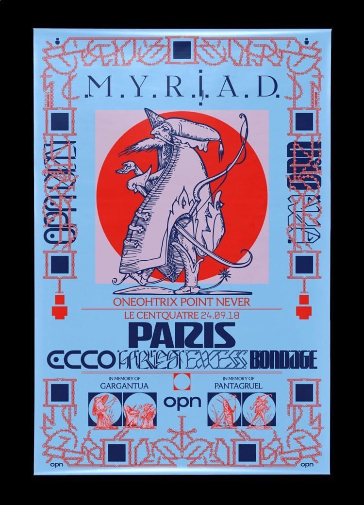
Joe cited the MYRIAD poster on the left and the two @rembagram type experiments below as his main inspiration for my commission alongside my typeface SOLACE, through which he found me. He's looking for an array of decorative and some more legible type as presented in the poster to the left that complements his brand aesthetic, at first for a gig night poster and then potentially for use, screen printed onto clothing. We have agreed to licence each typeface by its application. He's also given me a set of on-brand words or phrases to mock up the type with, as seen in the screenshot below.


The first point of reference other than the provided pictures was, of course, to check out the collectives Instagram page to gauge a feeling for its general aesthetic. As can be seen in the below screenshot @state.of.denial has quite a definite medieval era set of reference points through the eyes of the 1970s ish punk revival ethic. The appropriation of suits of armour, swords and military-style clothing is reimagined to fit a 2020 narrative of a fight against the class system, patriarchy and authority in general. His previous uses of typography have been entirely refined to Times New Roman which is a really nice clean slate to be working off. Times was of course designed for publication application in the early 20th century and has come to represent a very standard traditionalism that conveys a feeling of power and authority. As one of my typefaces, a rework of Times that's more specific to the aesthetic of the brand is essential.

Initial research into punk subgenre typography was as expected to some extent at odds with S.O.D's current aesthetic with regards to typography as the collective has as of yet used very consistent graphic applications, compared to the D.I.Y collage or at times very obviously hand drawn aesthetic of the movement. However, there are definite similarities within the iconic Never Mind The Bollocks - Sex Pistols album artwork below as within other well-known punk typography of the era. The relationship between print media and especially newspapers is clear as they represent the system and those in charge, the appropriation of these typefaces to create subversive messages are classic and very relevant. Also, the vibrant clashing colour pallet is, of course, a similarity.
The other major direction of research was into medieval era calligraphy and incredibly decorative elaborate forms such as the blackletter below. This is also more the direction that Joe is hinting at with his given examples of work he likes. Having a mixture between the influence of the hand and that of machined typography is going to be an essential balancing act to strike throughout the project.

Moving on one era the renaissance move from calligraphy forms to the introduction of the Gutenberg press in the 1400s should be a feature of my outcomes. This is because of the importance of the two techniques. The machined type seen below represents standardised Roman forms and none more standard than times new Roman. In stark contrast to its handwritten and more expressive counterparts drawn with a pen or brush. This almost acts as a metaphor for the repression of expression within human nature, an issue that the punk genre actively seeks to expel and subvert.


Comments
Post a Comment