Psychology of logo shapes
Heres an article I found on logo shapes and their psychological connotations.

"Particular logo shapes send out particular messages:
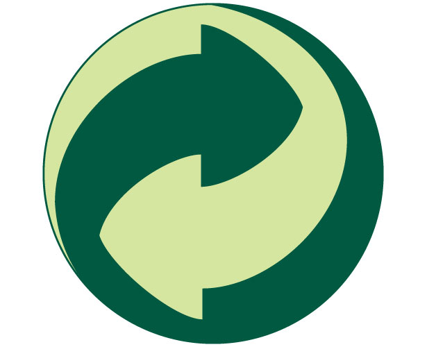
- Circles, ovals and ellipses tend to project a positive emotional message. Using a circle in a logo can suggest community, friendship, love, relationships and unity. Rings have an implication of marriage and partnership, suggesting stability and endurance. Curves on any sort tend to be viewed as feminine in nature.
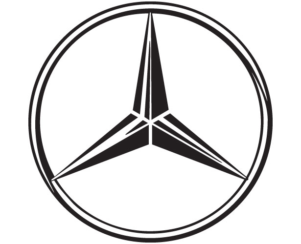
- Straight edged logo shapes such as squares and triangles suggest stability in more practical terms and can also be used to imply balance. Straight lines and precise logo shapes also impart strength, professionalism and efficiency. However, and particularly if they are combined with colours like blue and grey, they may also appear cold and uninviting. Subverting them with off-kilter positioning or more dynamic colours can counter this problem and conjure up something more interesting.
- It has also been suggested that triangles have a good association with power, science, religion and law. These tend to be viewed as masculine attributes, so it's no coincidence that triangles feature more prominently in the logos of companies whose products have a masculine bias.
- Our subconscious minds associate vertical lines with masculinity, strength and aggression, while horizontal lines suggest community, tranquillity and calm.
- The implications of shape also extend to the typeface chosen. Jagged, angular typefaces may appear as aggressive or dynamic; on the other hand, soft, rounded letters give a youthful appeal. Curved typefaces and cursive scripts tend to appeal more to women, while strong, bold lettering has a more masculine edge."
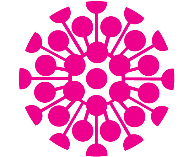
From this article, I would deduce that my logo should have a balance of circular and straight lines to indicate both the community and unity a circle denotes and professionalism and efficiency of straighter forms. It's important to also consider the relationship these forms will have with colour and composition. If I'm running with the key theme of perpetual motion then a circular logo with a strapline or logotype underneath could be perfect. Below I looked into a whole range of circular logos for an idea of what might work.
I think of the main attributes that make circular logos effective is that they can contain a focal point wrapped up in a wholistic silhouette. Circles are scientifically the most satisfying shape our eyes can take in due to their continuation around the never-ending curved, they are easy to process and satisfying. Keeping this in mind they can then have a hierarchy of forms within them that often emanate from the centre as this gives them total radial symmetry. The balance attracts the eye into the focal point which can be at the centre for a wholly two-dimensional idea or anywhere if the circle is made to look like a sphere.
Community groups and other local brands often go fro circles a sign of togetherness and whole but also they're popular amongst global megabrands as a bid to appear more approachable and calming.
Another benefit of circles is that they're very versatile when being placed onto a given application. They can fit well within a square and triangle. I need to consider the shape of potential application surfaces.


Comments
Post a Comment