dabble research
Today I've made a start on my research for the dabble logotype brief that I want to submit on the 18th. The brief reads:
Considerations:
PAYMENT
The selected designer(s) will be paid £200 for the use of their logo.
SUBMISSIONS
Please submit a pdf or low-resolution jpeg concept of your logo design, along with examples of its use/appearance in a variety of different formats (app/online, social media, marketing materials, cargo bike design, etc.). Please also provide a statement outlining how you feel you have answered the brief."


"Dabble is a sustainable start-up company aiming to offer zero emissions bicycle delivery service in Leeds.
From their app, customers will be able to shop at all the independent shops on their local high street. They’ll be able to buy items for multiple shops (meat from butchers, veg from greengrocers and wine from wine shop), pay for them with one payment and have them delivered to the local area with zero emissions via an electric Dutch cargo bike.
THE BRIEF
Dabble are commissioning an artist to design their logo.
Details:
The logo will appear on their app as well as on marketing material, uniforms and most importantly, the side of the cargo bikes.
Criteria:
- The main logo should include the company name (plus an option without the company name, for use on social media)
- It should be easily readable and recognisable – the bikes will be moving fast!
- Bright and visible – easy to see for the cyclist’s safety
Considerations:
- Eye-catching – colourful and vibrant
- Clean, minimal and modern
- Consider the nature of the company – zero emissions
PAYMENT
The selected designer(s) will be paid £200 for the use of their logo.
SUBMISSIONS
Please submit a pdf or low-resolution jpeg concept of your logo design, along with examples of its use/appearance in a variety of different formats (app/online, social media, marketing materials, cargo bike design, etc.). Please also provide a statement outlining how you feel you have answered the brief."
Although this is essentially just calling for a logo I think it's a good opportunity to for me to explore the synergy between a logotype, motif and full typeface as three cornerstones of identity that are best suited to my skillset. Hopefully going beyond the expectation of the brief with a typeface will put me in a good position to claim the £200.
I began with splitting my research down into 3 categories: conceptual (trying to attach concepts for copy and imagery to the fledgeling brand), typographic (looking at type and typographers that I can use as inspiration) and competitors (looking at existing brands associated with the cycle courier market)
Under the first topic of conceptualisation first, the primary ethic of the brand needed to be considered such as the carbon neutrality, impetus on shopping local and quick, reliable delivery.
The first thing that sprang to mind is the various 'shop local' campaigns that have become popular over the last 10 years as a means of urban regeneration and encouraging people to support local business as a backlash to the online shopping craze. An application that taps into the modern way of shopping via digital means but only sources businesses that are a cycle ride away is perfect for a number of reasons environmental and economic. Normally I associate cutesy hand-done illustrations or rounded edge vectors with these campaigns, promoting neutrality and a low-key, grassroots aesthetic. These campaigns are not appealing to me but maybe because they're aimed at a completely different target market of primary consumer e.g. families. Perhaps an approach aimed at one of the primary users of courier apps, my peers would be more effective for this type of campaign.
Carbon Neutrality -
"Carbon neutrality, or having a net-zero carbon footprint, refers to achieving net-zero carbon dioxide emissions by balancing carbon emissions with carbon removal or simply eliminating carbon emissions altogether."
As mentioned in the brief the company is striving for a zero carbon footprint and classes it as a major selling point, therefore, it would make a lot of sense to incorporate this into the semiotics of the branding. Of course the colour green or a teal is most commonly associate with this but there is some danger in using colour this synonymous with a set area of commerce, Dabble still needs to look like a bicycle courier, the eco-credentials are only a small element of the wholistic company.
It's well documented that the bicycle is the most efficient car low carbon intensity mode of transport so there is inevitably some scope to include parts of the vehicle within the branding. Also, the bike wheel of course, in part, looks like the number 0. Presenting the idea of a wheel with a 0 or green colouring, in a similar way that the symbol for carbon footprint has come to be a green foot.
There is also a potential for incorporating line qualities that demonstrate speed or movement as seen in many vehicular sports team logos. They tend to be almost exclusively san-serif, often italicised and the logotype itself if often dominant so as to allow for legibility at speeds.
The 1970s and 80s come to mind as an era for dynamic design without limitations. They are also currently a fetishised eras within graphic design for UX as the clean lines of international style typography are clear and universal. This culminates beautifully in f1 car decals from the era as universally weighted type is juxtaposed with abstract patterns designed to both look good at speed and simulate movement when stationary. The below example from the 1980s benetton f1 team encapsulates this point perfectly.
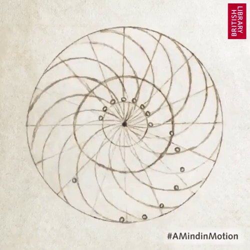
Wheel of perpetual motion -
When pondering historical examples of kinetic wheels and one more relevant than the fuel-thirsty wheels of a motorcar, the perpetual motion machine is perhaps the aptest application to the zero-carbon theme. https://www.youtube.com/watch?v=4b8ZsFszE8I
"Perpetual motion is the motion of bodies that continues forever. A perpetual motion machine is a hypothetical machine that can do work indefinitely without an energy source. This kind of machine is impossible, as it would violate the first or second law of thermodynamics."
Although only ever a hypothetical system that never actually worked the aspirational idea appears perfect for an application to carbon neutrality. Of course, when a wheel is created with weights evenly placed that move with only an initial stimulus such as a push gravity will eventually cause it to stop because the centre of gravity isn't in the middle of the wheel but instead at its lowest point. They can however at least be described as a very efficient recycler of energy as the physical exertion to get the machine moving is little but the wheel will continue to spin for way longer than a wheel without weights. Some of the old sketches and blue printer are particularly beautiful and the aesthetic in general is both akin to (if not actually using) a bike wheel and a potentially attractive semiotic for the brand. However, perhaps using any form of wheel is a bit too obvious.
Tomorrow I'll continue to research with a look at typography.
Comments
Post a Comment