Dabble research 3 - existing competition and logistics
For this final instalment of the initial research, I looked into the existing market to gauge exactly what I'm expected to produce and see how I can innovate in an already saturated market. The first thing to consider is what Dabbles USP is. They're claiming to provide a carbon-neutral service entirely through bicycle courier, which I believe would make them a first in Leeds. Also, I think the emphasis on local produce and not just take away etc separates them from the likes of deliveroo, just eat and uber eats. Therefore colour, iconography and general aesthetic should be in some way distinctive whilst recognisable as belonging to the sector.
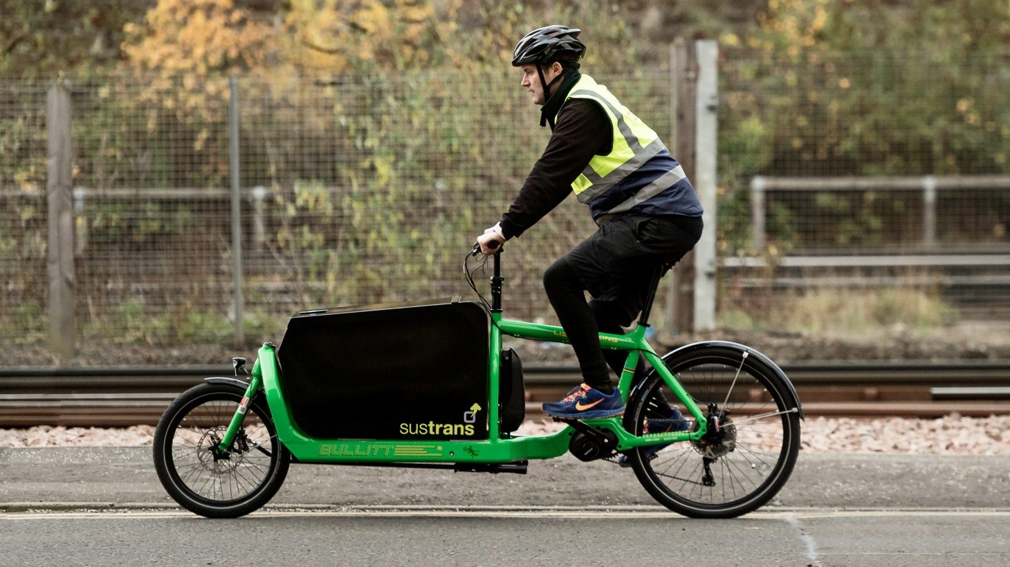
I had to clarify exactly what a dutch cargo bike was but managed to find a lot of images online of the type of vertical. Giving me an idea of the space for graphics on the body of the bike.
When searching generally on cycle delivery systems it appears that global logistics giants such as DHL and FedEx, with their iconic and well-documented logotypes, offer a cycle courier service. Although in a far larger network, these two could still be classified as potential rivals for a stake of the market share due to the sector they operate in. The DHL logo is of course highly dynamic like some the examples I explored yesterday, with a clear sense of directional movement and gestalten rules of continuation heavily applied. I should definitely explore this avenue as a quite literal interpretation of the companies purpose. For a slightly more lateral approach, FedEx has one of the most over discussed logotypes in graphic design with the hidden arrow between the E and the x. This approach to semiotics through negative space gives a more subtle interpretation of the company and makes them seem assured and capable yet more relaxed than DHLs aggressive italics and hard lines. I think due to the local produce orientation of Dabble the second aesthetic of FedEx would probably be more appropriate.


The three giants of fast-food and other local convenience delivery are undeniably Just Eat, Uber Eats and Deliveroo. Each taking an enormous chunk of the takeaway market, I presume dabble will operate slightly differently delivering more food for long term use instead of instant consumption. All of these companies and interestingly almost everyone in the sector goes for sanserif logotypes, perhaps a reflection of the contemporary nature of the industry as well as a bid to seem more universal and friendly. Interestingly all of these logotypes go for a coloured background with predominantly white text, this will be due to legibility and viewing pleasure when on a screen for app and web users and therefore is worth noting for dabble. Uber eats and Deliveroo seem to plump for a bright accent colour to help their cyclists be seen and promote instant brand recognition. As just eat works slightly differently and uses mainly car-based delivery this is not so important and they appear to utilise just about every colour. The incorporation of a rabbit for Deliveroo is endearing and offers a recognisable motif but honestly why a rabbit? What's the rationale? It's certainly not immediately obvious.

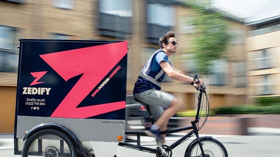
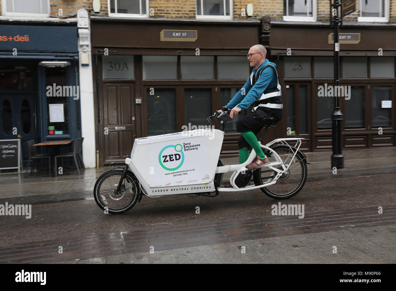
With regards to companies that are literally doing the same (or a very similar) thing to what Dabble intend of bringing to Leeds, there are a fair few. Unsurprising a lot of these couriers also choose to play on the fact they're offering a zero-emissions service. ZEDIFY and ZED are some of the first to come up after a quick search (unsure if they're related). ZEDIFY go for dynamic, dynamic, dynamic as an aesthetic choice with a Z motif akin to the effort Zoro carves into trees and images created using a long exposure to simulate dizzyingly fast movement whilst the rider seems calm and the branding is in focus. I like the logotype itself because it's technically fully upright in but appears to be slightly italicised due to diagonal lines on some of the smaller stretches of the silhouette. Implementation of some kind of photographic strategies should also be considered for dabbles branding. As for ZEDIFYs more reserved older brother ZED, which stands for Zero Emission Delivery the branding is far more relaxed and tranquil, they're playing more on the eco-credentials in contrast to ZEDIFYS speed speed speed over everything, the red on black colourway vs the blue and green gradient on white is a stark contrast. I need to decide where Dabble is situated in this tug of war between two of the main selling points.
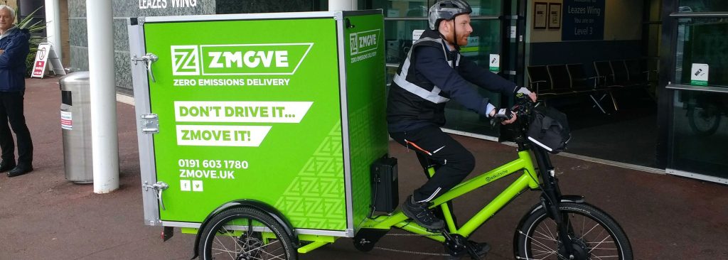
There are a few other companies on the block, all sporting garishly recognizable colours and some interesting copy. ZMOVE's 'Don't Drive It... ZMOVE it' is a bit questionable but does have its place and I can understand the rationale behind Zero Emissions Devlivery being condensed into ZMOVE, I mean ZED was already taken... Clever copy is important for this brief so I'll need to consider something that links in with my chosen concept well and its a bit catchier than 'Don't Drive It... ZMOVE it'.
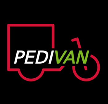
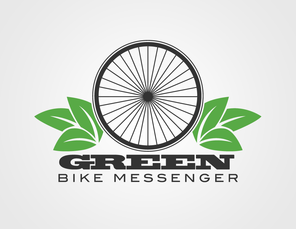
Below are two awful *to be avoided* logotypes. I can see what PEDIVAN were going for but the bike online to be printed onto a bike seems like overkill, when people see it out and about they'll probably deduce that its a cycle courier and won't need to be told. The italics text that's somehow meant to become a part of the frame as well is very clunky and the use of 4 colours including the black background is confused and unnecessary in my opinion. As for the random 'GREEN bike messenger' logo I found on images, the aesthetic is dated so weirdly with a wheel that looks as if it's from horse and cart not aided by the bay leaf setups on either side and the chunky slap serif straight out of a western.
I had to clarify exactly what a dutch cargo bike was but managed to find a lot of images online of the type of vertical. Giving me an idea of the space for graphics on the body of the bike.
When searching generally on cycle delivery systems it appears that global logistics giants such as DHL and FedEx, with their iconic and well-documented logotypes, offer a cycle courier service. Although in a far larger network, these two could still be classified as potential rivals for a stake of the market share due to the sector they operate in. The DHL logo is of course highly dynamic like some the examples I explored yesterday, with a clear sense of directional movement and gestalten rules of continuation heavily applied. I should definitely explore this avenue as a quite literal interpretation of the companies purpose. For a slightly more lateral approach, FedEx has one of the most over discussed logotypes in graphic design with the hidden arrow between the E and the x. This approach to semiotics through negative space gives a more subtle interpretation of the company and makes them seem assured and capable yet more relaxed than DHLs aggressive italics and hard lines. I think due to the local produce orientation of Dabble the second aesthetic of FedEx would probably be more appropriate.
The three giants of fast-food and other local convenience delivery are undeniably Just Eat, Uber Eats and Deliveroo. Each taking an enormous chunk of the takeaway market, I presume dabble will operate slightly differently delivering more food for long term use instead of instant consumption. All of these companies and interestingly almost everyone in the sector goes for sanserif logotypes, perhaps a reflection of the contemporary nature of the industry as well as a bid to seem more universal and friendly. Interestingly all of these logotypes go for a coloured background with predominantly white text, this will be due to legibility and viewing pleasure when on a screen for app and web users and therefore is worth noting for dabble. Uber eats and Deliveroo seem to plump for a bright accent colour to help their cyclists be seen and promote instant brand recognition. As just eat works slightly differently and uses mainly car-based delivery this is not so important and they appear to utilise just about every colour. The incorporation of a rabbit for Deliveroo is endearing and offers a recognisable motif but honestly why a rabbit? What's the rationale? It's certainly not immediately obvious.
With regards to companies that are literally doing the same (or a very similar) thing to what Dabble intend of bringing to Leeds, there are a fair few. Unsurprising a lot of these couriers also choose to play on the fact they're offering a zero-emissions service. ZEDIFY and ZED are some of the first to come up after a quick search (unsure if they're related). ZEDIFY go for dynamic, dynamic, dynamic as an aesthetic choice with a Z motif akin to the effort Zoro carves into trees and images created using a long exposure to simulate dizzyingly fast movement whilst the rider seems calm and the branding is in focus. I like the logotype itself because it's technically fully upright in but appears to be slightly italicised due to diagonal lines on some of the smaller stretches of the silhouette. Implementation of some kind of photographic strategies should also be considered for dabbles branding. As for ZEDIFYs more reserved older brother ZED, which stands for Zero Emission Delivery the branding is far more relaxed and tranquil, they're playing more on the eco-credentials in contrast to ZEDIFYS speed speed speed over everything, the red on black colourway vs the blue and green gradient on white is a stark contrast. I need to decide where Dabble is situated in this tug of war between two of the main selling points.
There are a few other companies on the block, all sporting garishly recognizable colours and some interesting copy. ZMOVE's 'Don't Drive It... ZMOVE it' is a bit questionable but does have its place and I can understand the rationale behind Zero Emissions Devlivery being condensed into ZMOVE, I mean ZED was already taken... Clever copy is important for this brief so I'll need to consider something that links in with my chosen concept well and its a bit catchier than 'Don't Drive It... ZMOVE it'.
Below are two awful *to be avoided* logotypes. I can see what PEDIVAN were going for but the bike online to be printed onto a bike seems like overkill, when people see it out and about they'll probably deduce that its a cycle courier and won't need to be told. The italics text that's somehow meant to become a part of the frame as well is very clunky and the use of 4 colours including the black background is confused and unnecessary in my opinion. As for the random 'GREEN bike messenger' logo I found on images, the aesthetic is dated so weirdly with a wheel that looks as if it's from horse and cart not aided by the bay leaf setups on either side and the chunky slap serif straight out of a western.
Comments
Post a Comment