36 days - E
Today was the letter E, there was an early change of plan. I had previously suggested I might base my E on either Eurostile the geometric, 60s sanserif by Aldo Novarese however I don't really want to base my responses off one typeface where I can and especially not a sanserif. Another option was Eric Gill but knowing his history as an abuser and all-round odd guy I decided this might not be the best idea for a competition and I'm forecasting a few options for humanist typography later in the project. With these considerations in mind, I decided to turn my attention to the perhaps quite broad field of experimental typography.
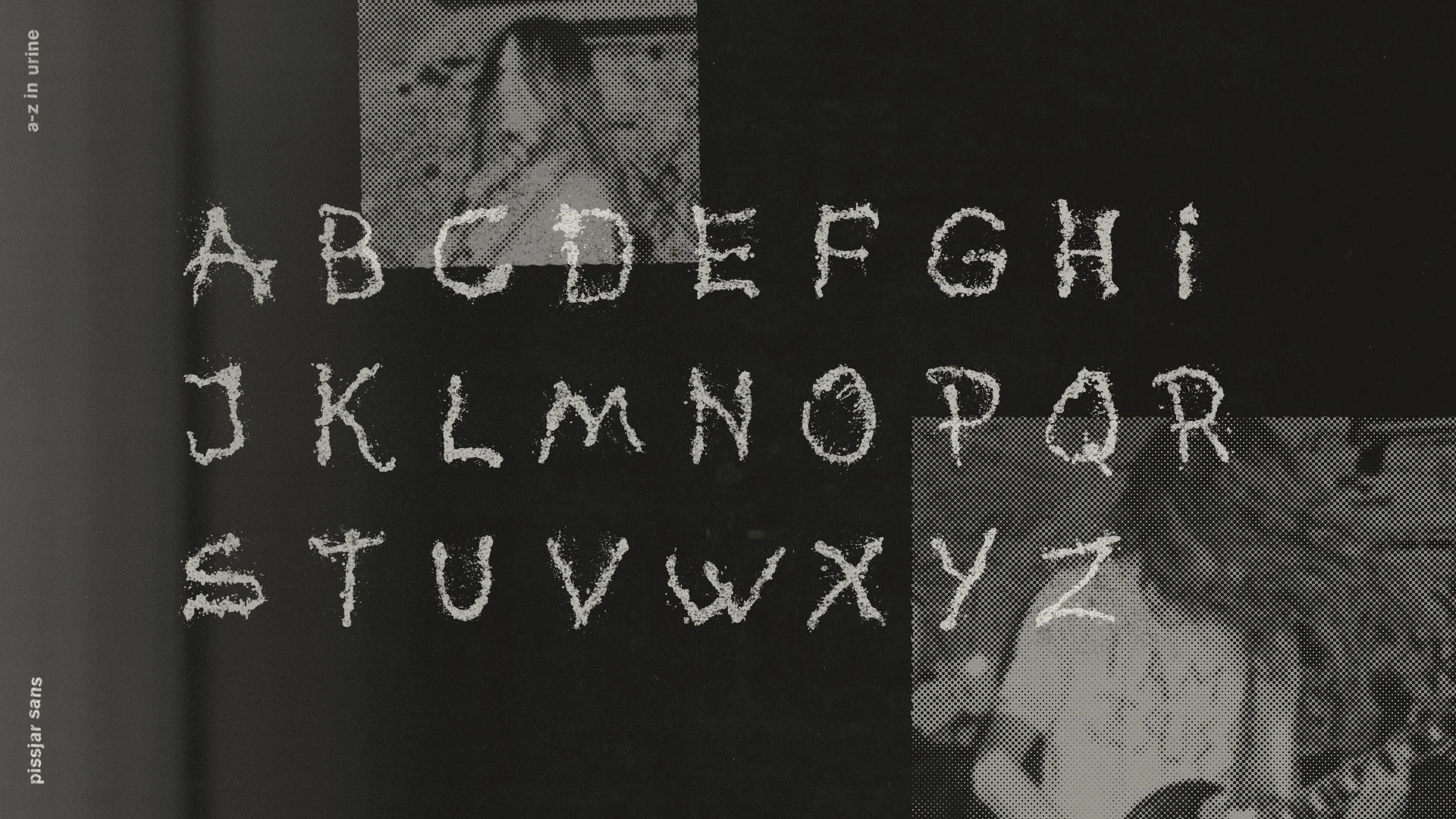
Experimental typography is exactly what it says it is "In the field of graphic design and typography, experiment as a noun has been used to signify anything new, unconventional, defying easy categorization, or confounding expectations" so, for example, the heights of experimental typography use non-traditional mediums such as physical objects that were never intended to be type but have been manipulated in such a way to make letterforms. For example, the below typeface created by Mossawi studios created using bursting liquid. Another liquid example is provided by a band called pissjar that created an appropriate typeface solely out of piss on canvas that was then vectorised to make it usable.


Another genre of experimental typography doesn't necessarily use an experimental medium, experimental can even just refer to the application of ordinary letterforms as was pioneered by Francis Picabia and the Dada movement in the early twentieth century. Experimental typography is said to place emphasis on expressing emotion, rather than having a concern for legibility while communicating ideas, hence considered bordering on being art.

With the aspect of experimental typography to express emotion in mind I decided to develop simple forms that embodied human characteristics namely a face as a simplistic means of going beyond the rudimentary values of type and create something semiotic and photographic.


"E is for experimental.
Pioneered by the dada movement and subsequently by a range of prominent type setters and designers. Experimental type places emphasis on the conveyance of emotion instead of the legibility of communication. What do you see in this E?"
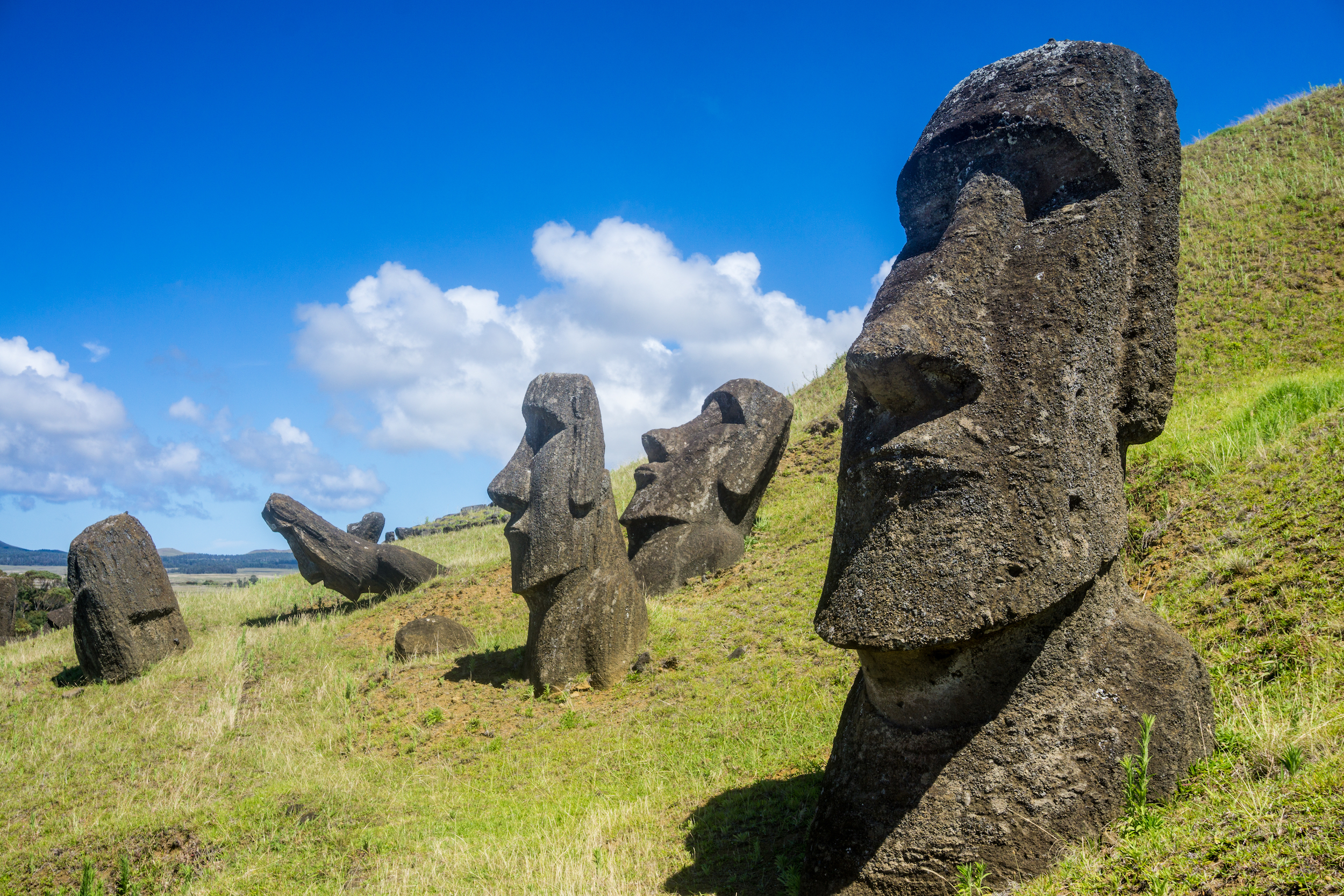
Posing the question "what do you see" opened up up some discussion around the forms semiotic value with the most common response being similarity to the easter island statues. An unintentional yet obvious link.
Experimental typography is exactly what it says it is "In the field of graphic design and typography, experiment as a noun has been used to signify anything new, unconventional, defying easy categorization, or confounding expectations" so, for example, the heights of experimental typography use non-traditional mediums such as physical objects that were never intended to be type but have been manipulated in such a way to make letterforms. For example, the below typeface created by Mossawi studios created using bursting liquid. Another liquid example is provided by a band called pissjar that created an appropriate typeface solely out of piss on canvas that was then vectorised to make it usable.
Another genre of experimental typography doesn't necessarily use an experimental medium, experimental can even just refer to the application of ordinary letterforms as was pioneered by Francis Picabia and the Dada movement in the early twentieth century. Experimental typography is said to place emphasis on expressing emotion, rather than having a concern for legibility while communicating ideas, hence considered bordering on being art.
With the aspect of experimental typography to express emotion in mind I decided to develop simple forms that embodied human characteristics namely a face as a simplistic means of going beyond the rudimentary values of type and create something semiotic and photographic.


"E is for experimental.
Pioneered by the dada movement and subsequently by a range of prominent type setters and designers. Experimental type places emphasis on the conveyance of emotion instead of the legibility of communication. What do you see in this E?"
Posing the question "what do you see" opened up up some discussion around the forms semiotic value with the most common response being similarity to the easter island statues. An unintentional yet obvious link.


Comments
Post a Comment