@36daysoftype - J
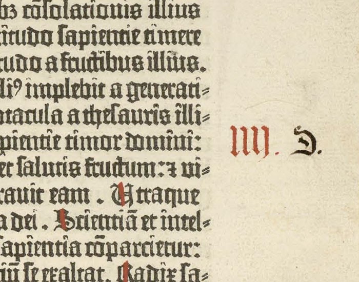
I couldn't think of too many typographic phrases beginning with the letter J so today's post was the first of a few artist tributes that I shall be doing over the course of the 36 days. Perhaps the most important tribute there can be for the field of typography, in general, is to Johannes Gutenberg the inventor of the original movable printing press in 1439. The tribute was specifically orientated around one of the worlds first 'mass-produced' books, The Gutenberg Bible, printed circa 1450. Gutenberg printed 158 or 180 copies (both numbers are mentioned) of which only 49 copies or substantial portions thereof survive today with one on the market today estimated to be worth possibly 1 billion pounds! and the last copy being sold in the 70s. The type within the Latin bible is a form of blackletter and therefor somewhat ironically looks handwritten. The specific genre of blackletter is called Donatus-Kalender, a form of textualis, which would have been moulded from molten metal and set by hand. Gutenberg then added certain hand-rendered elements such as paragraph notations, hand-painted illustrations and even certain notations to dictate internal or external monologue. Red lines were also placed through some capitals in post in a bid to aid legibility and pace of reading. I also found a hand-etched illustration of Gutenberg for display.

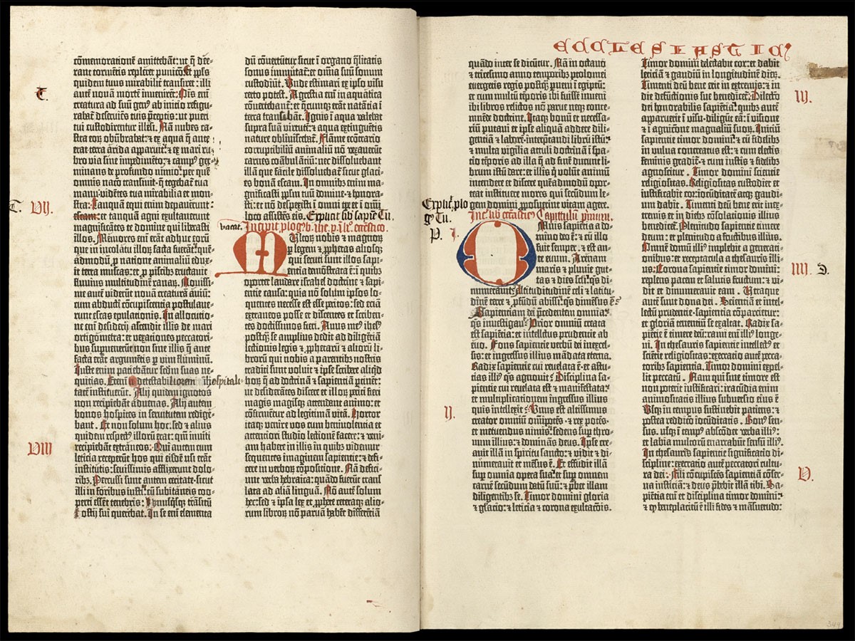


Using the original Donatus-Kalender typeface as a reference I began to sketch out ideas for an adapted J using a 6mm calligraphy pen. Legibility of the original form was the first concern as the descender has no flick on it as we would expect from a contemporary J. This was added and overall fluidity of the very vertical form was improved.
This lead to the final below complete tiles with a slight paper effect filter overlay and two illustrated birds taken from one of the original pages. hand-drawn page annotations and a second tile with the etching of Gutenberg wrap up the compositions.
Post:
"J is for Johannes Gutenberg - a tribute to the inventor of the original movable type printing press in 1439. One of his first productions was a mass printed Latin bible known as the Gutenberg Bible using Donatus-Kalender blackletter, hand drawn illustrations and paragraph notations"


Comments
Post a Comment