@36daysoftype - A
Today I started my 36 days of type with the letter A. I decided to focus on Asemic writing for today, a genre of type that I have long been interested in by not even so much as sketched.

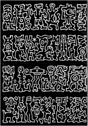


"Asemic writing is a wordless open semantic form of writing. The word asemic means "having no specific semantic content", or "without the smallest unit of meaning". With the non-specificity of asemic writing there comes a vacuum of meaning, which is left for the reader to fill in and interpret."
"It derives from my feeling of linguistic confusion. I desire to communicate and be understood, but a lifetime of resultant confusion and misunderstanding makes me feel as though the mechanism I am using is insufficient or incapable of bridging the gap between us, the me and the you, the two poles of communication which seem to always be slipping away from one another.” - Jay Snodgrass
"It derives from my feeling of linguistic confusion. I desire to communicate and be understood, but a lifetime of resultant confusion and misunderstanding makes me feel as though the mechanism I am using is insufficient or incapable of bridging the gap between us, the me and the you, the two poles of communication which seem to always be slipping away from one another.” - Jay Snodgrass

I really liked the idea of creating something as lateral as possible if I somehow managed to unshackle my typographic conscious from the ink that was being transferred onto the paper then perhaps some really interesting results could come out. I saw the task as a bit of a typographic experiment like none I have ever done before, I had no idea what intricacies would come out and was curious to see whether this technique could be introduced further into my practice. However, of course, the main question remained how was I going to create a letterform that both represented an A and was asemic, the only way I could see to do so was to do asemic text that conformed to or around a letterform that was easily recognisable as an A. So I got sketching, genuinely intrigued as to what would be produced.
Heres my initial two sketches with one bonus that was a quick effort to produce an A for the Arts and Crafts movement that was quickly scrapped as I preferred the aesthetic and individually of working with asemics. Initially, I used a wide nibbed pen in an attempt to emulate the work of Jay Snodgrass which I thought created a very beautiful form. However, a finer nib gave the potential to create way more detail and truly explore asemics and the unconscious outcomes of my mind when I was trying not to write in any manmade characters. Also flipping to the negative outside of the character being the asemic text allowed for more text to be scribed and a richer quality of outcomes. I drew it all freehand with the idea of an A in my head, going for the traditional flat pointed sanserif style as I believe this is the most legible form of an A in the current times.


Heres my initial two sketches with one bonus that was a quick effort to produce an A for the Arts and Crafts movement that was quickly scrapped as I preferred the aesthetic and individually of working with asemics. Initially, I used a wide nibbed pen in an attempt to emulate the work of Jay Snodgrass which I thought created a very beautiful form. However, a finer nib gave the potential to create way more detail and truly explore asemics and the unconscious outcomes of my mind when I was trying not to write in any manmade characters. Also flipping to the negative outside of the character being the asemic text allowed for more text to be scribed and a richer quality of outcomes. I drew it all freehand with the idea of an A in my head, going for the traditional flat pointed sanserif style as I believe this is the most legible form of an A in the current times.

I included the original sketch as my secondary Instagram tiles, an approach that I could continue for the duration of the competition but we'll see how I go because of course, not all sketches will look so neat and portable. I also couldn't help but notice that at least once there were sequences of nonsemantic text that appeared to feature my name. Looking carefully I found a number of sections that vaguely resembled SOL, therefore these featured beneath my final digitalized A as some abstract non-deliberate logotypes. I found this unconscious slip very interesting but I suppose it's logical that if perhaps the one thing we still write out onto paper in day to day life if our own name then the muscle memory and brain even when trying specifically not to form words or letters will slip into this pattern. I would like to continue this project in future.
Post:
"A is for Asemic - a tribute to the wordless, open semantic form of writing that sits somewhere between text and image.
Featuring some accidental, abstract logotypes.
I’m going to be producing an eclectic mixture of type over the next 36 days so keep your eyes peeled"

Featuring some accidental, abstract logotypes.
I’m going to be producing an eclectic mixture of type over the next 36 days so keep your eyes peeled"


Comments
Post a Comment