36days of type - R
Today was a quite definite R for Roman. The terms 'Roman' has become semi-ambiguous in modern typography as a Roman format now refers to any typeface where the vertical strokes are mostly upright, therefore meaning Helvetica is an example of Roman type. Of course, I was more focusing on the incredibly mathematical and regimented serifed forms inspired by and used in the ancient Roman era.
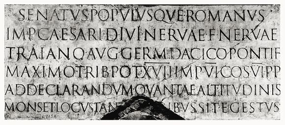
"In Latin script typography, roman is one of the three main kinds of historical type, alongside blackletter and italic. Roman type was modelled from a European scribal manuscript style of the 15th century, based on the pairing of inscriptional capitals used in ancient Rome with Carolingian minuscules developed in the Holy Roman Empire."
Roman typography contrasts rigid backbones and geometrically set serifs with a more decorative diagonal stroke that will also conform to a geometric curve. I also looked into renaissance interpretations of Roman type as this era is, of course, better preserved and documented. The ethic of the Renaissance preserved a large amount of integrity. I appropriated the borders from the Renaissance, semi Venetian composition seen bellow.


My sketches were on grided paper to help line up the various elements in typically roman style. I also had an early inkling to extend and exaggerate the slick of the R slightly as is seen with a rational Roman era Q for example. This was just to give a bit more flair to the forms and provide further contrast. As capital Roman scripts were designed to promote a universal definition of legibility but this aspect isn't necessary here as I was only recreating one letter in isolation.

 After experimenting with the join between the flick, loop and backbone a few times eventually settled for a loop that extends down into the lower half of the letter. This would nicely line up with a grid circle bellow and provide an interesting negative space for the upper loop.
Here were my final outcomes. Both colours picked from ancient or renaissance interpretation designs. The background is filtered a little to look like old stone or vellum. Renaissance borders frame the first tile nicely giving some extra embellishment to what is otherwise a fairly straight forward yet satisfying form.

I then displayed a second tile that included the grid circles as a nod to the process and perfect geometries and mathematics that go into roman type.

Caption:
"R is for Roman - the Renaissance era presented a move away from blackletter, looking for a more legible letterform and finding inspiration from simplistic carved forms used during the Roman Empire. Laid out on geometric grids."
The post was well-received by peers and the community alike.
"In Latin script typography, roman is one of the three main kinds of historical type, alongside blackletter and italic. Roman type was modelled from a European scribal manuscript style of the 15th century, based on the pairing of inscriptional capitals used in ancient Rome with Carolingian minuscules developed in the Holy Roman Empire."
Roman typography contrasts rigid backbones and geometrically set serifs with a more decorative diagonal stroke that will also conform to a geometric curve. I also looked into renaissance interpretations of Roman type as this era is, of course, better preserved and documented. The ethic of the Renaissance preserved a large amount of integrity. I appropriated the borders from the Renaissance, semi Venetian composition seen bellow.
My sketches were on grided paper to help line up the various elements in typically roman style. I also had an early inkling to extend and exaggerate the slick of the R slightly as is seen with a rational Roman era Q for example. This was just to give a bit more flair to the forms and provide further contrast. As capital Roman scripts were designed to promote a universal definition of legibility but this aspect isn't necessary here as I was only recreating one letter in isolation.


Here were my final outcomes. Both colours picked from ancient or renaissance interpretation designs. The background is filtered a little to look like old stone or vellum. Renaissance borders frame the first tile nicely giving some extra embellishment to what is otherwise a fairly straight forward yet satisfying form.

I then displayed a second tile that included the grid circles as a nod to the process and perfect geometries and mathematics that go into roman type.

Caption:
"R is for Roman - the Renaissance era presented a move away from blackletter, looking for a more legible letterform and finding inspiration from simplistic carved forms used during the Roman Empire. Laid out on geometric grids."
The post was well-received by peers and the community alike.


Comments
Post a Comment