36 days of type - Q
Today was a tricky letter to plan for, I had a look for any possible alternatives to Quill last night with only the already mentioned quaint (the old-time link between lowercase letters) and Quecha (south American tribe) coming up. Quaint was a tricky form to incorporate into a stand-alone capital Q because it's normally associated with the link between two lowercase letters such as ct. The Quecha people didn't have much reference to typographic forms within their traditional art to I felt it was a bit of a reach to do a letter inspired by them when there were more obviously typographic options available. Quill seemed a bit vague as its a tool not a style of writing per se but it is heavily associated with script style so this formed much of the research and inspiration.
"A quill pen is a writing tool made from a moulted flight feather (preferably a primary wing-feather) of a large bird. Quills were used for writing with ink before the invention of the dip pen, the metal-nibbed pen, the fountain pen, and, eventually, the ballpoint pen.[1] The hand-cut goose quill is rarely used as a calligraphy tool, because many papers are now derived from wood pulp and wear down the quill very quickly. However, it is still the tool of choice for a few scribes who noted that quills provide an unmatched sharp stroke as well as greater flexibility than a steel pen."
I decided to look into the era that came between the 6th-century invention of the quill and its eventual complete antiquity that happened in the 1800s when the fountain ben was invented. In the 15-1700s quills had been adapted into dip pens that incorporated metal tips, allowing the penman to achieve a variety of widths depending on the force they exert. This lead me onto the incredibly decorative and flourishing genre of Round Hand.
"Round Hand (also Roundhand) is a type of handwriting and calligraphy originating in England in the 1660s primarily by the writing masters John Ayres and William Banson. Characterised by an open flowing hand (style) and subtle contrast of thick and thin strokes deriving from metal pointed nibs, Round Hand's popularity grew rapidly, becoming codified as a standard, through the publication of printed writing manuals."
I decided further look into a penman from the 1700s, towards the end of the dipped pen era, this was so as to ensure that I had a wealth of well preserved and documented material to research and base my stroke on.
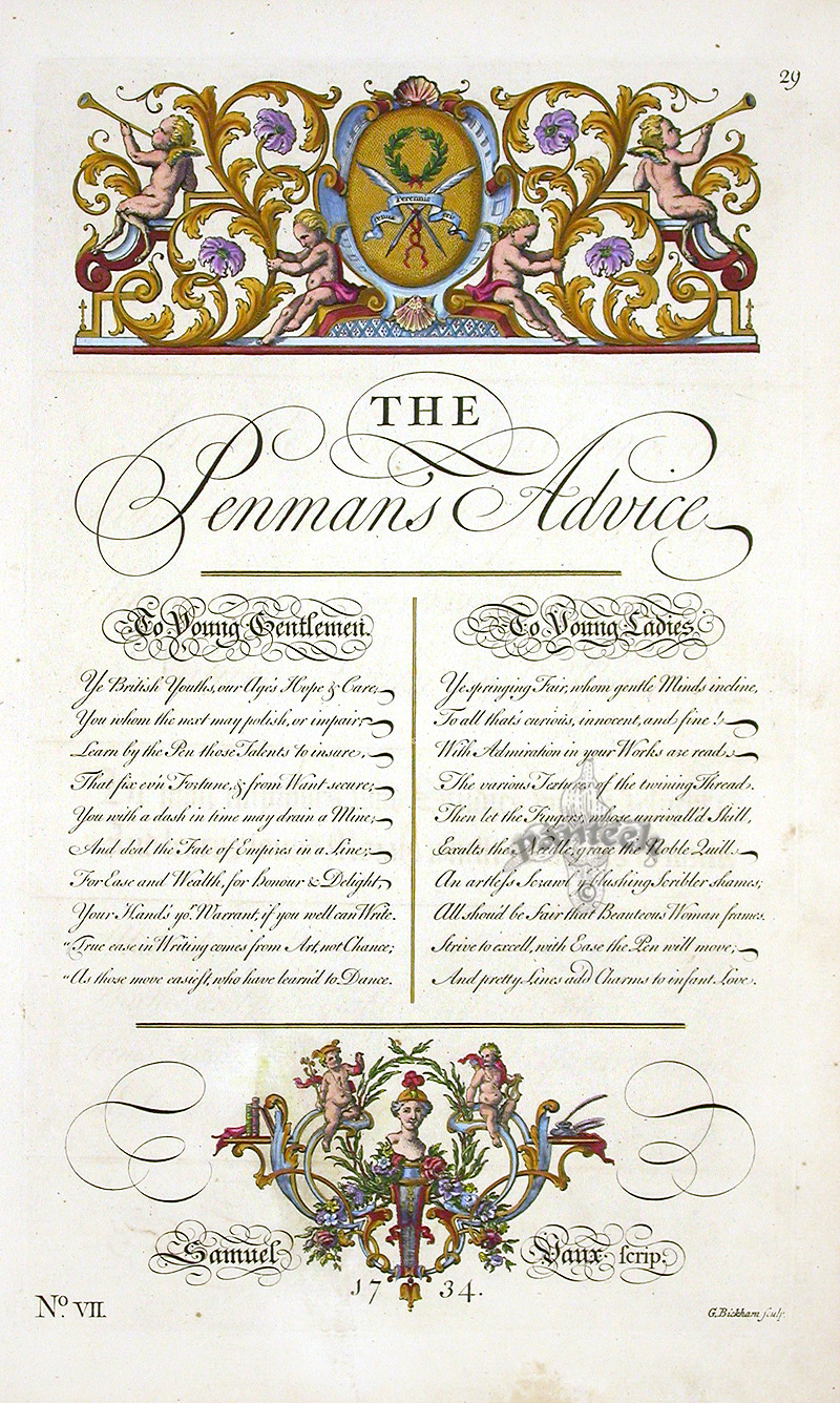


Beckhams Universal penman provided most of the inspiration for the type itself as well as the appropriated embellishments that accompanied the letter. The cherubs felt a little tacky but I felt the element of digital collage was nice and added some fun to the piece, they were also well received by peers so I stuck with them. The next step was to work out how I recreate this style without the traditional pen. Expectedly a lot of the process had to happen in post. The traditional round head, single looping line was eventually favoured for the Q form with of course a slight cursive incline to simulate handwriting.


"A quill pen is a writing tool made from a moulted flight feather (preferably a primary wing-feather) of a large bird. Quills were used for writing with ink before the invention of the dip pen, the metal-nibbed pen, the fountain pen, and, eventually, the ballpoint pen.[1] The hand-cut goose quill is rarely used as a calligraphy tool, because many papers are now derived from wood pulp and wear down the quill very quickly. However, it is still the tool of choice for a few scribes who noted that quills provide an unmatched sharp stroke as well as greater flexibility than a steel pen."
I decided to look into the era that came between the 6th-century invention of the quill and its eventual complete antiquity that happened in the 1800s when the fountain ben was invented. In the 15-1700s quills had been adapted into dip pens that incorporated metal tips, allowing the penman to achieve a variety of widths depending on the force they exert. This lead me onto the incredibly decorative and flourishing genre of Round Hand.
"Round Hand (also Roundhand) is a type of handwriting and calligraphy originating in England in the 1660s primarily by the writing masters John Ayres and William Banson. Characterised by an open flowing hand (style) and subtle contrast of thick and thin strokes deriving from metal pointed nibs, Round Hand's popularity grew rapidly, becoming codified as a standard, through the publication of printed writing manuals."
I decided further look into a penman from the 1700s, towards the end of the dipped pen era, this was so as to ensure that I had a wealth of well preserved and documented material to research and base my stroke on.
"George Bickham the Elder (1684–1758) was an English writing master and engraver. He is best known for his engraving work in The Universal Penman, a collection of writing exemplars which helped to popularise the English Round Hand script in the 18th century.
In 1712, Bickham wrote copy books and business texts, as there was a strong link between writing and mathematics instruction (arithmetic and bookkeeping) in the-mid 17th century to early 18th century.
Bickham the Elder collected from twenty-five London writing masters in 1733 to create and engrave the penmanship samples forming the Universal Penman, which was reported to be the most important and popular of copy texts used by writing masters to instruct their pupils."Beckhams Universal penman provided most of the inspiration for the type itself as well as the appropriated embellishments that accompanied the letter. The cherubs felt a little tacky but I felt the element of digital collage was nice and added some fun to the piece, they were also well received by peers so I stuck with them. The next step was to work out how I recreate this style without the traditional pen. Expectedly a lot of the process had to happen in post. The traditional round head, single looping line was eventually favoured for the Q form with of course a slight cursive incline to simulate handwriting.


Comments
Post a Comment