36 days of type - N
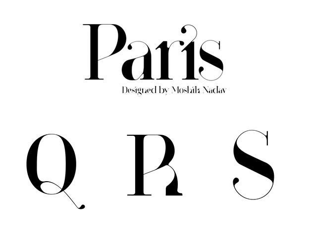
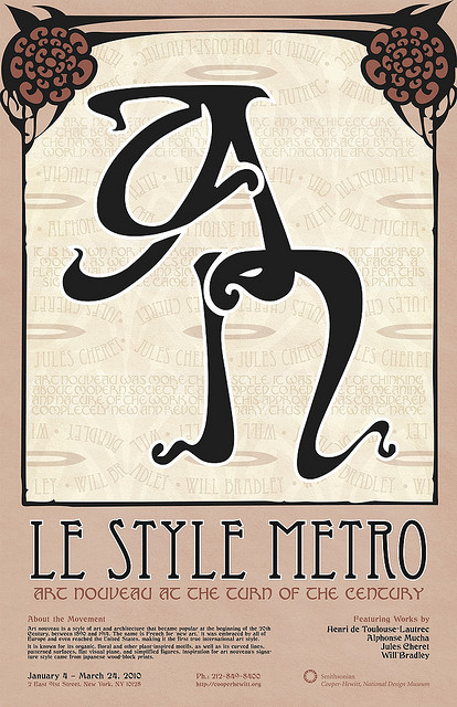
N is for Nouveau. I have previously worked on art nouveau inspired type making it a perfect option for today's N. The super-expressive nature of the forms makes it a genre that I feel comfortable with. I started with some really general research into art nouveau type and looked for a specific area of the movement I could attach the letter to.

As a slightly abstract influence, I also looked at the SciFi inspired typographer and designer Patrick Saville. The absurdist and seemingly limitless abstraction of the scifi genre is very much so shared with that of the Art Nouveau era and I feel there is a lot of overlap between the two styles.


I eventually landed on the Place Etienne Pernet designed by Alfred Wagons. The ornate Parisian building completed in 1905 has a plethora of interesting features that for me were just begging to be typography.


From this research, I began to sketch almost exclusively using a ballpoint pen for this effort which was a new approach to the genre for me as I have used a calligraphy pen previously when designing Art Nouveau. This gave me a lot of freedom to create the expressive forms and was in part down to the patrick saville influence. I felt the notch on the left shoulder of the N was essential as it represents the structural supports beneath each balcony. The detail work on the facade of the balcony itself and around the gateway entrance to the building were also hugely inspiring during the development process.


Digital development involved playing with the right foot and deciding where the decorative extension of the right arm went and how it could interact with the rest of the letter.
This was the final post:
"N is for Nouveau - based on the dreamlike fluidity of art nouveau architecture this N is specifically referencing Alfred Wagons extravagant 1905 facade at Place Étienne Pernet in Paris."


As a slightly abstract influence, I also looked at the SciFi inspired typographer and designer Patrick Saville. The absurdist and seemingly limitless abstraction of the scifi genre is very much so shared with that of the Art Nouveau era and I feel there is a lot of overlap between the two styles.


I eventually landed on the Place Etienne Pernet designed by Alfred Wagons. The ornate Parisian building completed in 1905 has a plethora of interesting features that for me were just begging to be typography.
From this research, I began to sketch almost exclusively using a ballpoint pen for this effort which was a new approach to the genre for me as I have used a calligraphy pen previously when designing Art Nouveau. This gave me a lot of freedom to create the expressive forms and was in part down to the patrick saville influence. I felt the notch on the left shoulder of the N was essential as it represents the structural supports beneath each balcony. The detail work on the facade of the balcony itself and around the gateway entrance to the building were also hugely inspiring during the development process.


Digital development involved playing with the right foot and deciding where the decorative extension of the right arm went and how it could interact with the rest of the letter.
This was the final post:
"N is for Nouveau - based on the dreamlike fluidity of art nouveau architecture this N is specifically referencing Alfred Wagons extravagant 1905 facade at Place Étienne Pernet in Paris."


Comments
Post a Comment