36 days of type - M
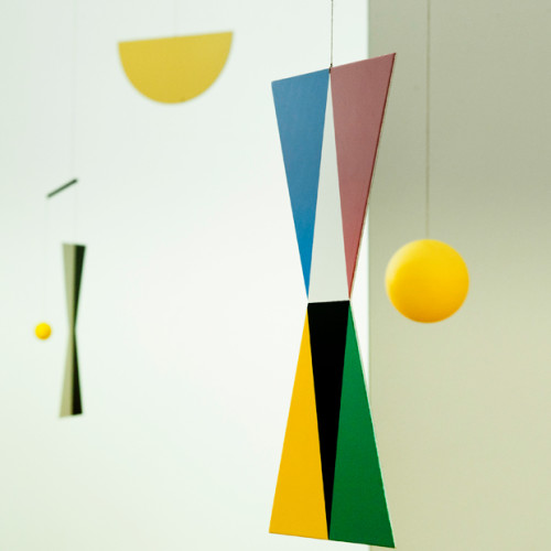
Today was the letter M and an opportunity to pay homage to the late, great designer, artist and inventor Bruno Munari. Having read a couple of his books and working in constant personal reference to Design as Art I thought this was an obvious decision instead of the other daily option modular. It was at first very tricky to think of what forms truly represent the multi-talented designer who, to my knowledge, never released a full typeface as such but has written extensively about type and done multiple illustrations. The research was mainly conducted through the pages of Design is art. His gestalten grasp of shapes within a wholistic typographic composition was something I wanted to portray as a priority. My favourite project of his is his useless machines sculptures/inventions so this was also a dominant early theme to the designs. His character sketches from a variety of experimental and lateral angles were eventually my primary inspiration.

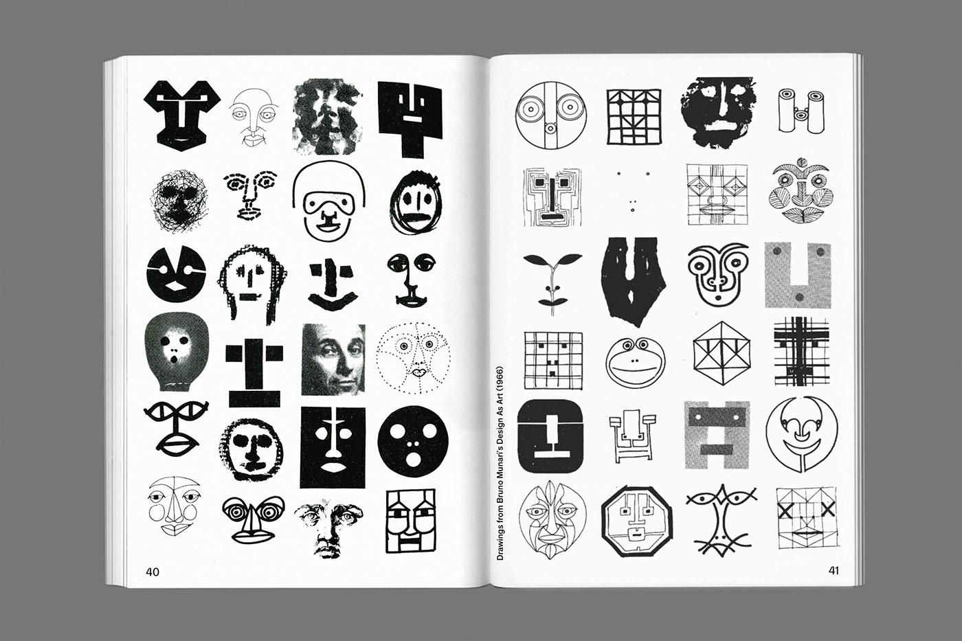
The sketching process involved a multitude of sketchbook drawings that broke down the structure and abstracted the letter M in the same vain that Munari broke down the elements of the face in Design as Art. The other development sketch involved was a 3D render creating an abstract M based on Munari's useless machines. However, the illustrator and photoshop render left a lot to be desired and looked a lot like a 90s computer game so were quickly moved on from.


 Once this wealth of sketches was assembled it made perfect sense to vectorise the results and assemble them holistically to create a large simple M based on the form used in Munari's logotype found in research.
The below 4 panels made up the days post alongside the caption:
"M is for Munari - a series of experimental, deconstructed M sketches as tribute to the Italian artist and designer Bruno Munari. His grasp of silhouette and holistic form is very inspirational. "


The sketching process involved a multitude of sketchbook drawings that broke down the structure and abstracted the letter M in the same vain that Munari broke down the elements of the face in Design as Art. The other development sketch involved was a 3D render creating an abstract M based on Munari's useless machines. However, the illustrator and photoshop render left a lot to be desired and looked a lot like a 90s computer game so were quickly moved on from.


The below 4 panels made up the days post alongside the caption:
"M is for Munari - a series of experimental, deconstructed M sketches as tribute to the Italian artist and designer Bruno Munari. His grasp of silhouette and holistic form is very inspirational. "


Comments
Post a Comment