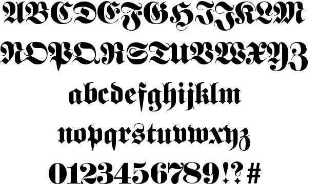
36 days of type - F
The F today marks my first dabble into blackletter, probably the first of many throughout this process. Having held off with the cursiva/cursive C it would have felt like a waste to not attempt Fraktur, one of the curvier forms of the ancient hand style, complementary to my own aesthetic. The style itself I knew fairly little about apart from the fact it's Germanic and vaguely curvy.


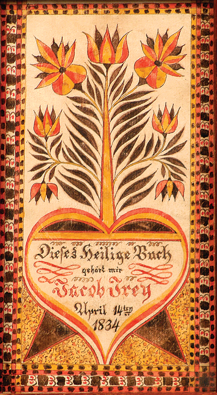
I also researched the decorative hand-done manuscripts pf the era for tile decoration reference. They appeared to feature a lot of floral decoration and quite simplistic geometric borders that influenced my own.


Here was my final post:


"Fraktur is a calligraphic hand of the Latin alphabet and any of several blackletter typefaces derived from this hand. The blackletter lines are broken up; that is, their forms contain many angles when compared to the smooth curves of the Antiqua (common) typefaces modeled after antique Roman square capitals and Carolingian minuscule. From this, Fraktur is sometimes contrasted with the "Latin alphabet" in northern European texts, which is sometimes called the "German alphabet", simply being a typeface of the Latin alphabet. Similarly, the term "Fraktur" or "Gothic" is sometimes applied to all of the blackletter typefaces (known in German as Gebrochene Schrift, "Broken Script").
The word derives from Latin fractūra ("a break"), built from fractus, passive participle of frangere ("to break"), the same root as the English word "fracture".
Besides the 26 letters of the ISO basic Latin alphabet,[1] Fraktur includes the ß (Eszett [ɛsˈtsɛt]), vowels with umlauts, and the ſ (long s). Some Fraktur typefaces also include a variant form of the letter r known as the r rotunda, and many a variety of ligatures which are left over from cursive handwriting and have rules for their use. Most older Fraktur typefaces make no distinction between the majuscules "I" and "J" (where the common shape is more suggestive of a "J"), even though the minuscules "i" and "j" are differentiated."
I also researched the decorative hand-done manuscripts pf the era for tile decoration reference. They appeared to feature a lot of floral decoration and quite simplistic geometric borders that influenced my own.
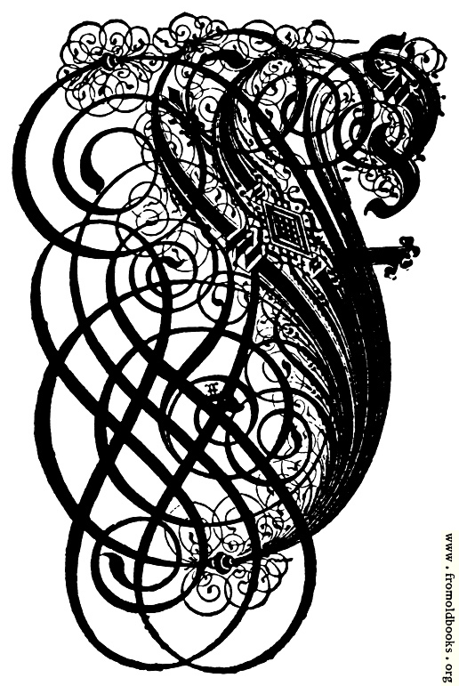
The key features of elaborate decoration and a fractured stroke made up of 'c' and 's' forms was the main feature of research I wanted to bring through in my design. I wanted the curvature to be semi-continuous and for the form to feed into itself. Also, it was essential to contemporise and avoid a pastiche of any previous Fraktur forms I had seen in research.
With this in mind, I got onto sketching with the 6mm PP. Feeling the need to be original it felt essential to try and innovate with the central crossbar and therefore a lot of designs originated around attempting to link up the descending form and this cross stroke. However, often this made the shape too abstract and made it semi illegible as an F. Upon peer reflection, the elaborate forms were favoured by peers, in which there were multiple decorative strokes and the letter was fractured into as many convoluted elements as possible.
With this in mind, I got onto sketching with the 6mm PP. Feeling the need to be original it felt essential to try and innovate with the central crossbar and therefore a lot of designs originated around attempting to link up the descending form and this cross stroke. However, often this made the shape too abstract and made it semi illegible as an F. Upon peer reflection, the elaborate forms were favoured by peers, in which there were multiple decorative strokes and the letter was fractured into as many convoluted elements as possible.


Here was my final post:
"F is for Fraktur - an interpretation of traditional Germanic blackletter comprised of fractured curved brush strokes in either ‘c’ or ‘s’ forms"


Comments
Post a Comment