36 days - O
Today I tackled the letter O. Originally I had OCR (optical character recognition) down or outline. I wanted to acknowledge the importance of the original OCR-A typeface and a new era for legibility in type. However, after some research into the typeface and the inherent simplicity of the genre, it really didn't seem like an area I could easily innovate in. The forms are so structured and strokes so consistent that it just wasn't for me as a one-off letter, I don't want to release anything I find boring.
So with that in mind, I quickly progressed to my secondary option 'Outline'. This is super vague and general but that gave me a lot of room to manoeuvre. The first thing I pondered was my opinion that 'everything looks better in outline', this (also imo) is due to the fact that we can't perceive weights of a stroke as easily when they aren't filled in, hence sketches always looking peng until you vectorise them and apply a fill.
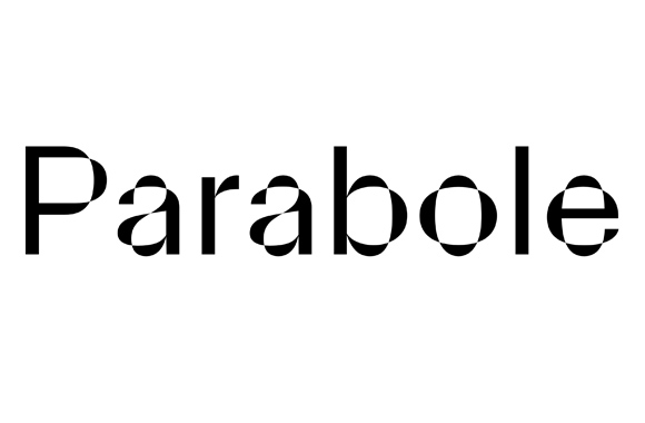
One typeface that instantly sprung to mind when considering interesting outlines and silhouettes within typography was Parabole by David Molnar and its logotype application by studio quatrieme etage for Blade. The way in which the internal outline interacts with the external silhouette is very interesting. I wanted to experiment with and further this concept.

Here is a page from my sketchbook as I tried to create the right overlapping shape that contained both internal and external outline in interaction. Below is the vector progression including hand-drawn lines on the overlapping space for the final idea.


These were my final 3 tiles accompanied by the description:
"O is for outline - outline and silhouette are three of the three main constituents of form alongside structure. Today I’ve been playing around with internal space and how it can interact with an external silhouette. "


So with that in mind, I quickly progressed to my secondary option 'Outline'. This is super vague and general but that gave me a lot of room to manoeuvre. The first thing I pondered was my opinion that 'everything looks better in outline', this (also imo) is due to the fact that we can't perceive weights of a stroke as easily when they aren't filled in, hence sketches always looking peng until you vectorise them and apply a fill.
One typeface that instantly sprung to mind when considering interesting outlines and silhouettes within typography was Parabole by David Molnar and its logotype application by studio quatrieme etage for Blade. The way in which the internal outline interacts with the external silhouette is very interesting. I wanted to experiment with and further this concept.
Here is a page from my sketchbook as I tried to create the right overlapping shape that contained both internal and external outline in interaction. Below is the vector progression including hand-drawn lines on the overlapping space for the final idea.


These were my final 3 tiles accompanied by the description:
"O is for outline - outline and silhouette are three of the three main constituents of form alongside structure. Today I’ve been playing around with internal space and how it can interact with an external silhouette. "


Comments
Post a Comment