36 days - K
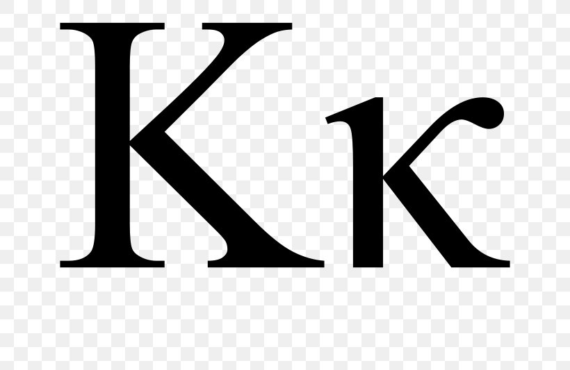
I had previously wanted todays K to represent kinetic type but I'm still pretty slow at working with movement and therefore ran out of time to do anything like that today. Instead, I moved back into familiar territory with my second choice of the Greek letter Kappa. The research was relatively brief and split into two main areas. Looking at how the letter was originally drawn and how it could be displayed on the final tile. From wiki:

The sketching phase inevitably turned up a few results that looked a lot like a H as well. In the end, it made the most sense to focus on a heavy contrast form as I haven't incorporated too much heavy contrast strokes into any of my daily submissions so far. Therefore this, fairly open to interpretation, character suits a stylistic change very well. When it came to translating the final vector into the Instagram tile, I quite liked the idea of applying a kind of corny gold bevel feature, implying the grandeur of the historic symbol and also referencing its use in American popular culture more recently with its attachment to frat houses.


"Kappa (uppercase Κ, lowercase κ or cursive ϰ; Greek: κάππα, káppa) is the 10th letter of the Greek alphabet, used to represent the [k] sound in Ancient and Modern Greek. In the system of Greek numerals, Kʹ has a value of 20. It was derived from the Phoenician letter kaph  . Letters that arose from kappa include the Roman K and Cyrillic К.
Greek proper names and placenames containing kappa are often written in English with "c" due to the Romans' transliterations into the Latin alphabet: Constantinople, Corinth, Crete. All formal modern romanizations of Greek now use the letter "k", however.[citation needed]
The cursive form ϰ is generally a simple font variant of lower-case kappa, but it is encoded separately in Unicode for occasions where it is used as a separate symbol in math and science. In mathematics, the kappa curve is named after this letter; the tangents of this curve were first calculated by Isaac Barrow in the 17th century."
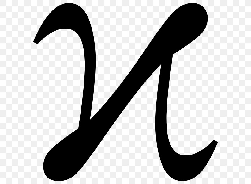
The most interesting format of the symbol is, of course, the cursive version which I find looks a little like a lowercase N, mainly because it shows clear lineage of how the K we use today has evolved from the single stroke of the hand.
The sketching phase inevitably turned up a few results that looked a lot like a H as well. In the end, it made the most sense to focus on a heavy contrast form as I haven't incorporated too much heavy contrast strokes into any of my daily submissions so far. Therefore this, fairly open to interpretation, character suits a stylistic change very well. When it came to translating the final vector into the Instagram tile, I quite liked the idea of applying a kind of corny gold bevel feature, implying the grandeur of the historic symbol and also referencing its use in American popular culture more recently with its attachment to frat houses.


The overlaid outline vector was a last-minute trial but confused the forms a lot and didn't really have the necessary rationale so the final two panels were obvious, a navy blue background was chosen as a perfect contrast for the gold effect which was completed in photoshop. Heres the post information:
"K is for Kappa - the tenth letter of the Greek alphabet and a precursor to the K we know and love today."


Comments
Post a Comment